Coca-Cola is the most recognized brand in the world, selling around 2 billion products daily, a truly impressive brand.
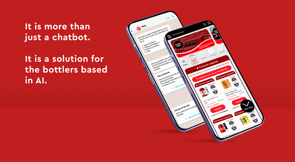
As a product designer, I developed a tool to facilitate the buying and selling process between bottlers and the distributor market through web applications, chatbots, among other communication systems.
Tools used: Figma, Miro, Illustrator, Photoshop, Azure and Teams.
Timeline: 12 months.
Team: 26 people including me as the product designer, managers, developers and business analysts.
Project management: Lean UX and Agile.
Countries applied: Mexico, Paraguay, Chile, Argentina and Brazil.
Results
— A design pattern created for all the bottlers with the design system
— 6% incresing in convertion
— 23 new features created
— Increased the overall Usability Score (SUS) from 65 (Poor) to 85 (Excellent) in post-launch testing
— Improved Discoverability rating from 2.5 to 4.2
Problem
Bottlers struggled with a confusing buying process that resulted in:
— High cart abandonment due to poor product discoverability
— Inconsistent experience across 5 countries
— Manual workarounds for routine tasks like equipment maintenance
— Low adoption (SUS score of 65)
Design / strategic improvements
Based on the reviews, research and analysis from the old version, I discovered some design issues to solve and improve the system.
Old version
Problems identified:
Design with old style
Problems of contrast in colors, fonts, spacing and boxes
Product without a specific branding
Different design patterns between the pages
Low highlight for the products
Different padding in components
New version
Improvements with the new version:
Modern design
Contrast accordingly with the WCAG guidelines
Branding and a logotype
Design system to create a strong pattern in the pages
Easy to find products by the new search bar
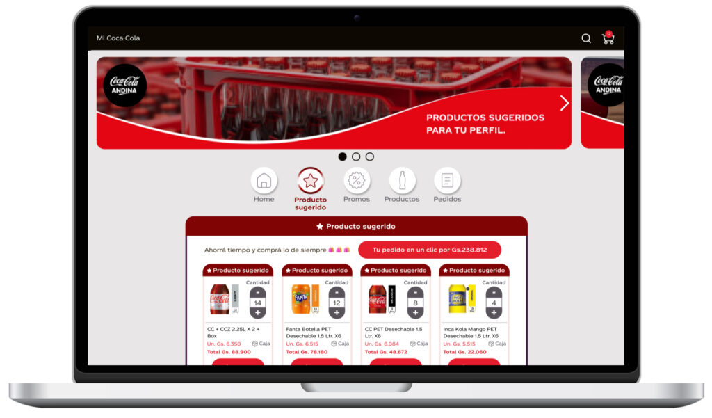
Good highlight for the products
Marketing improvements through discovery (similar to stories)
Padding adjustment in all pages
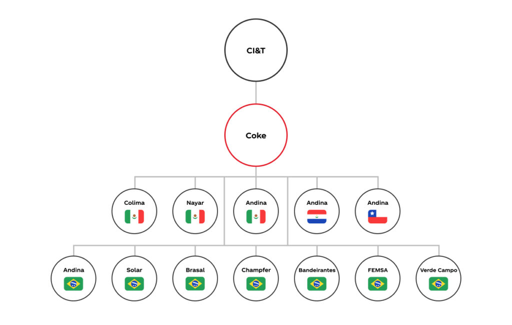
Stakeholder map
Our project has many stakeholders involved as managers, business analysts, developers and the owners of the bottlers.
In order to understand the flux to present the work and get the approvals I created the stakeholder map with all the bottlers and countries involved.
This map was used to define communication channels and prioritize feedback loops, ensuring alignment and timely approvals across bottlers in five distinct Latin American markets.
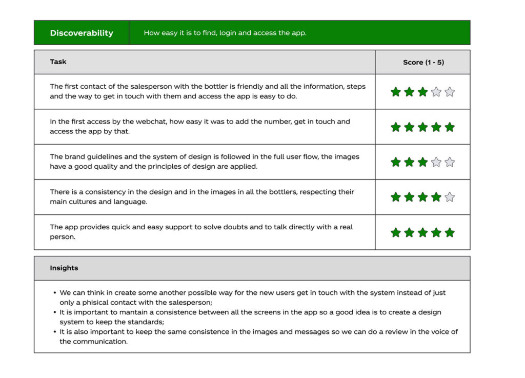
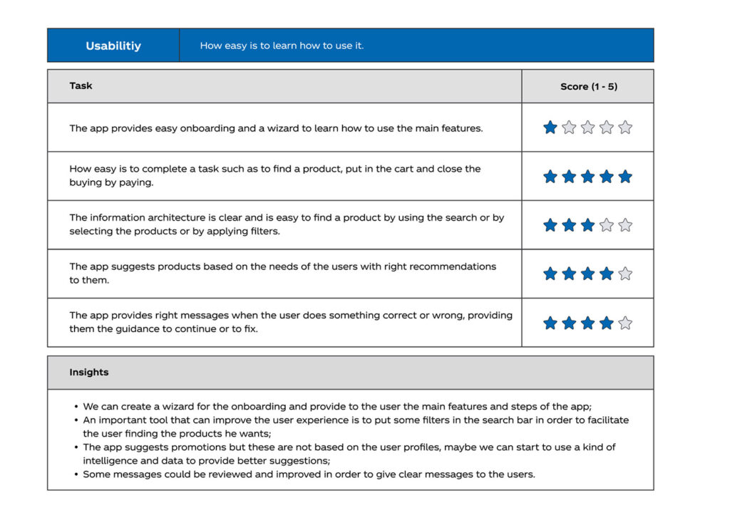
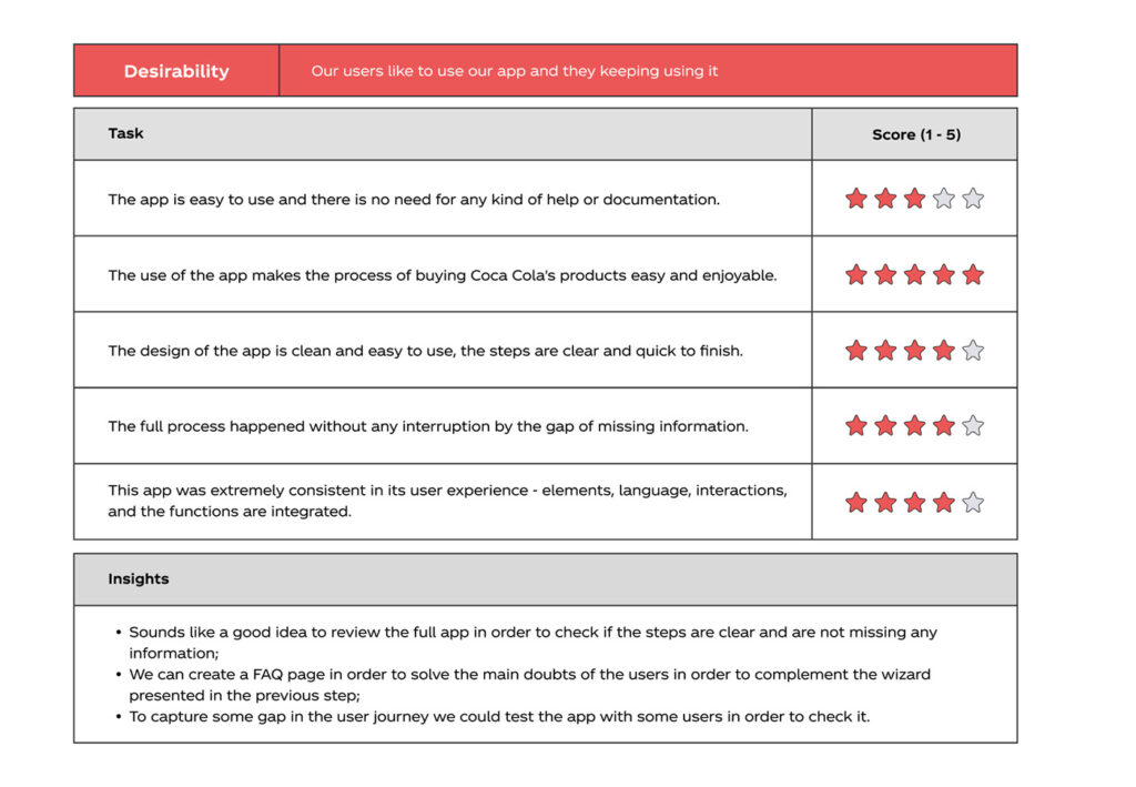
UX scorecard analysis
I began by analyzing our customer acquisition funnel and evaluating the ease of the in-app purchasing experience.
To systematically assess the platform, I used a UX scorecard framework that combines the System Usability Scale (SUS) with the Technology Acceptance Model (TAM).
This methodology enabled us to measure three key performance areas:
Discoverability — How easily users find, access, and authenticate within the app
Usability — How intuitively users learn and navigate the interface
Desirability — Whether users find value in the experience and return consistently
Competitive analysis
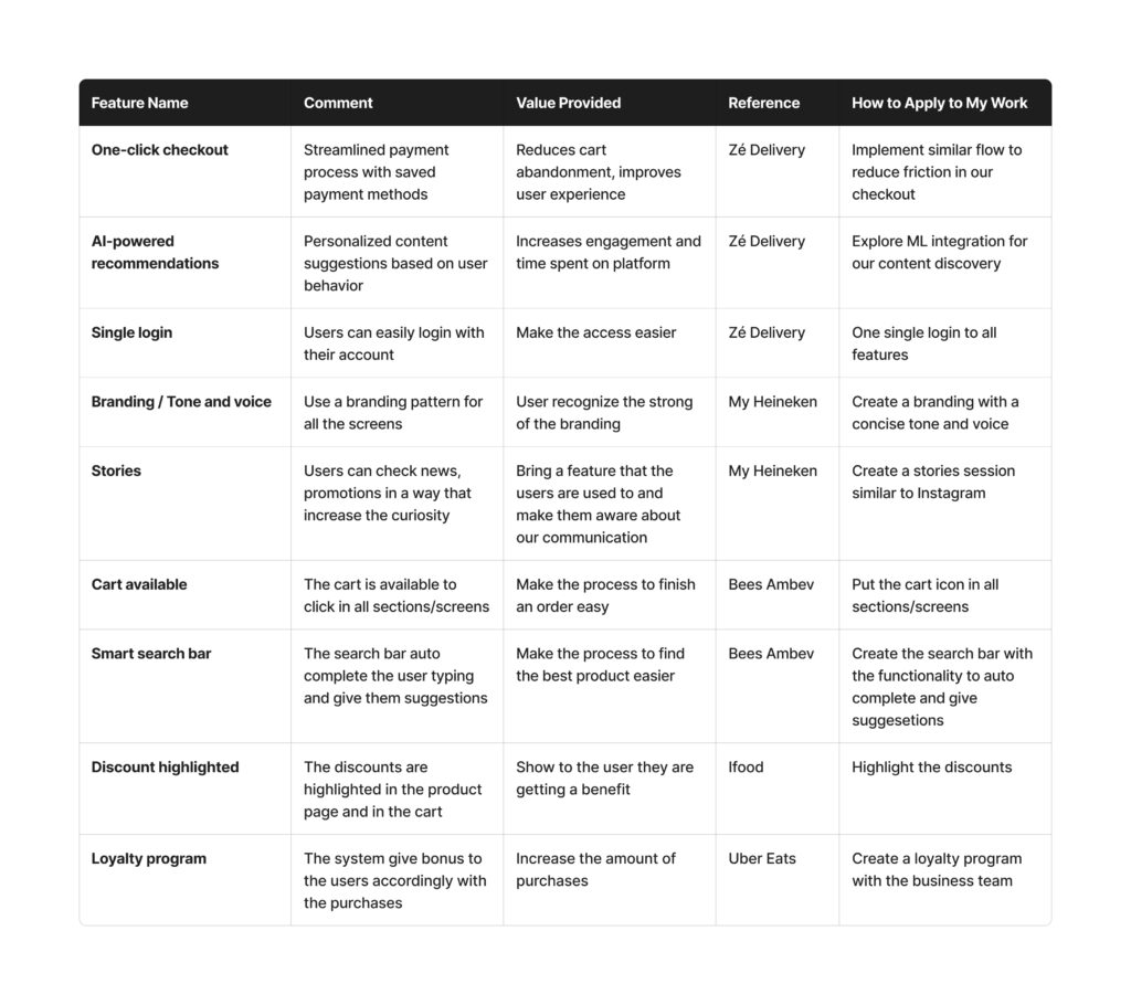
To do a competitive analysis I listed some possible direct and indirect competitors in order to get insights for possible actions and improvements.
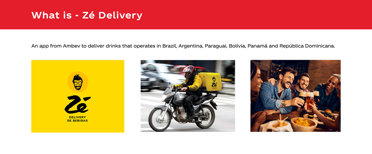
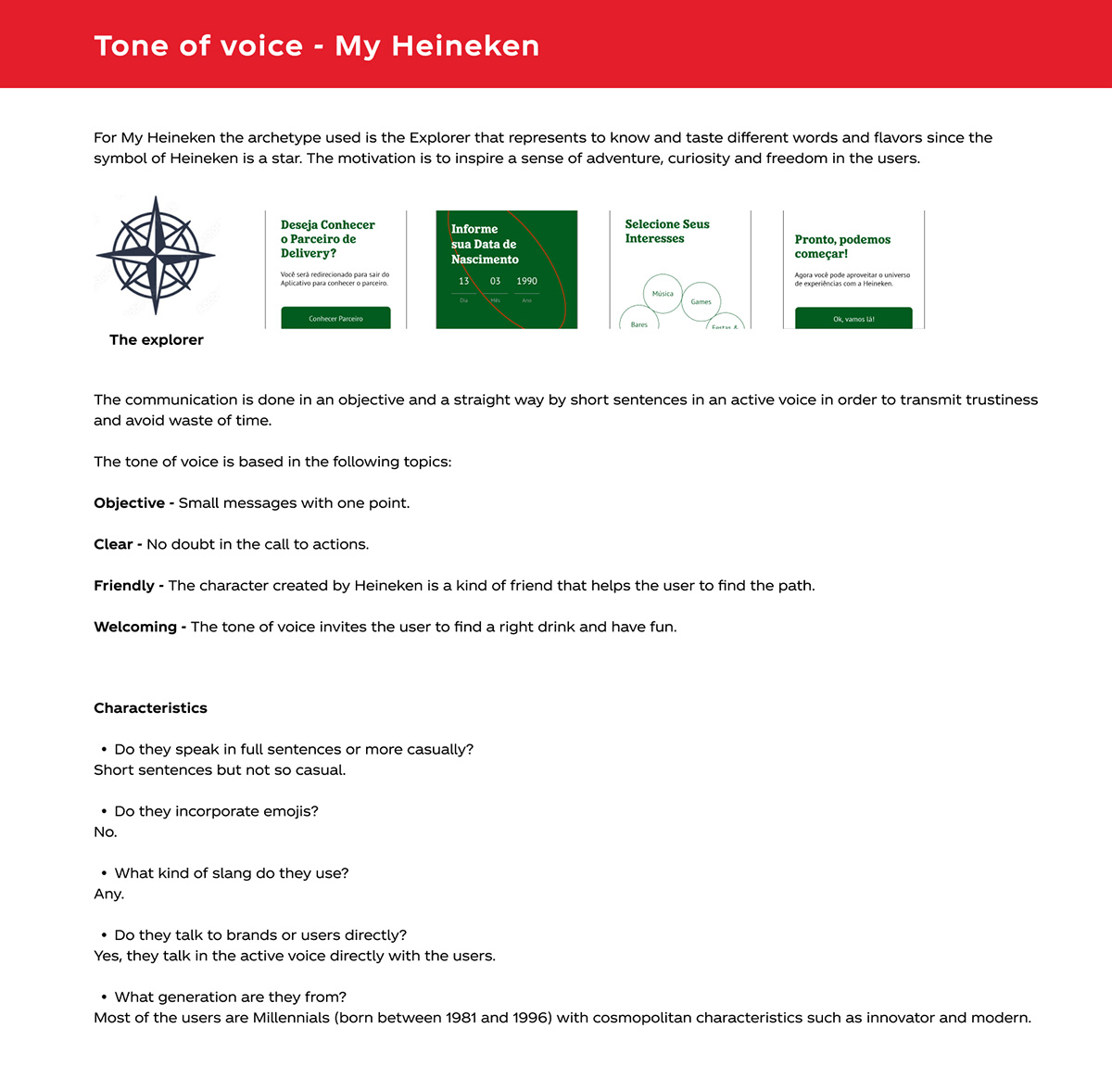
Direct competitors: Zé Delivery, Heineken app and Bees Ambev.
Indirect competitors: Ifood and Uber Eats.
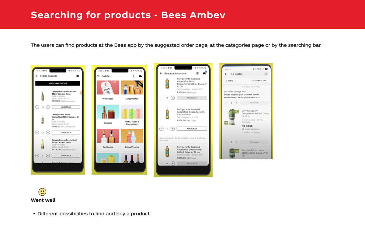
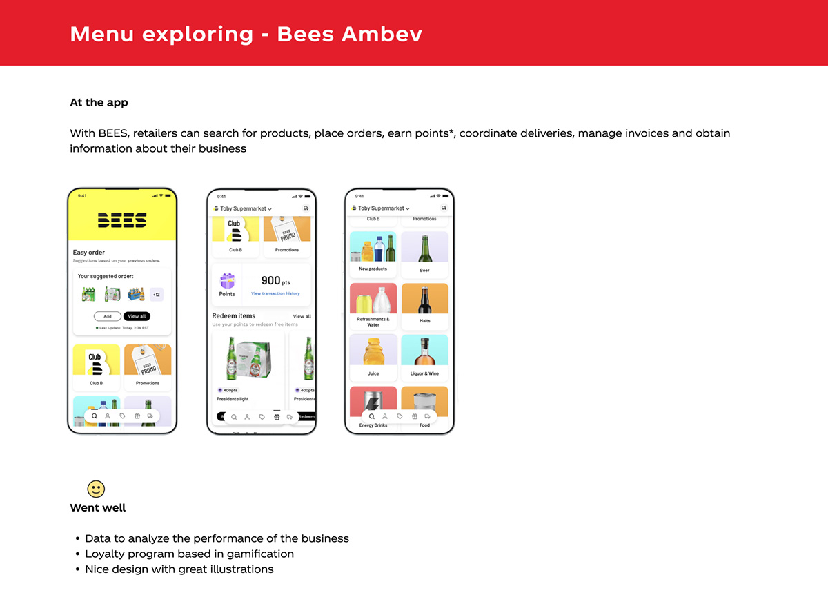
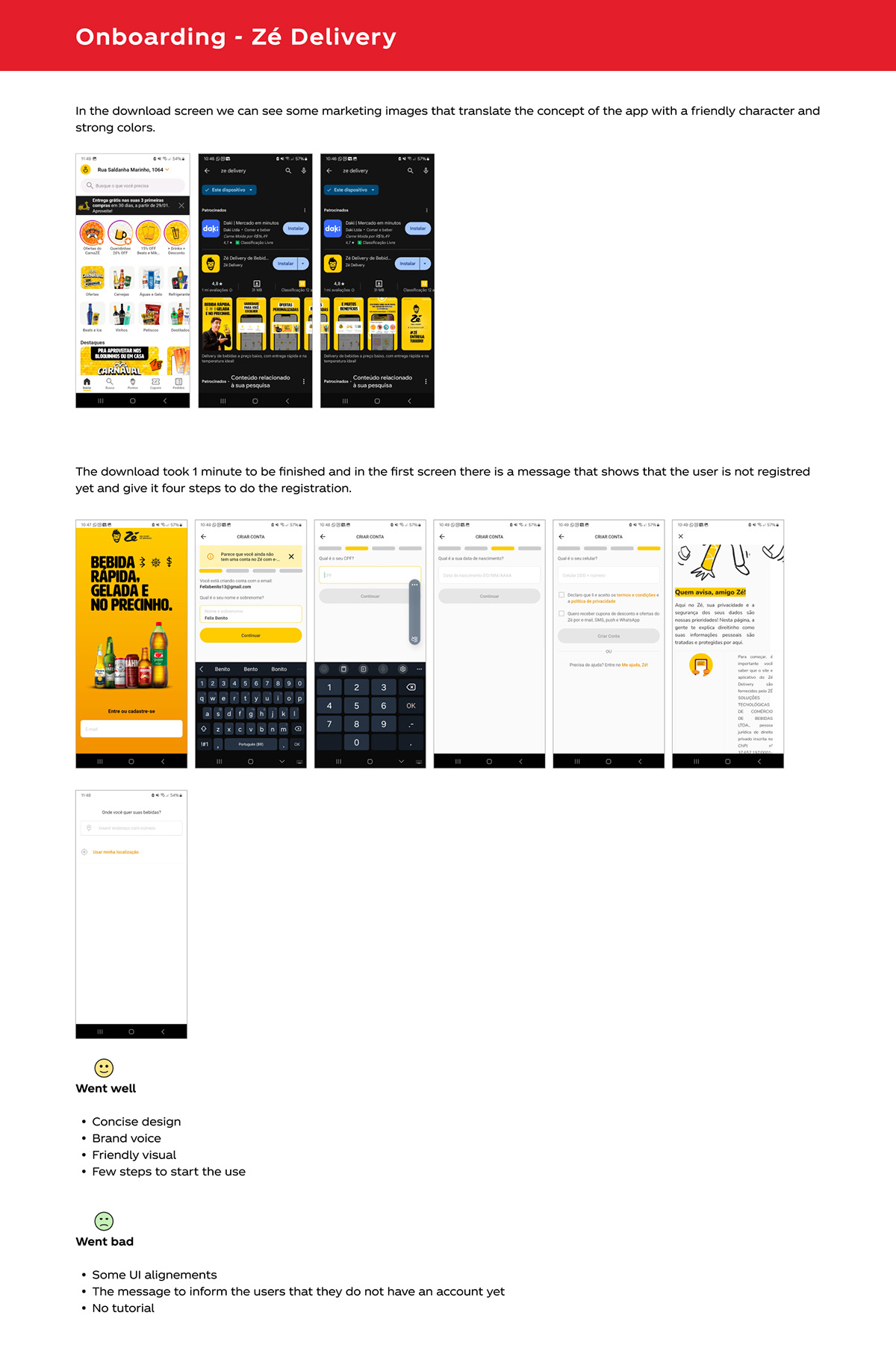
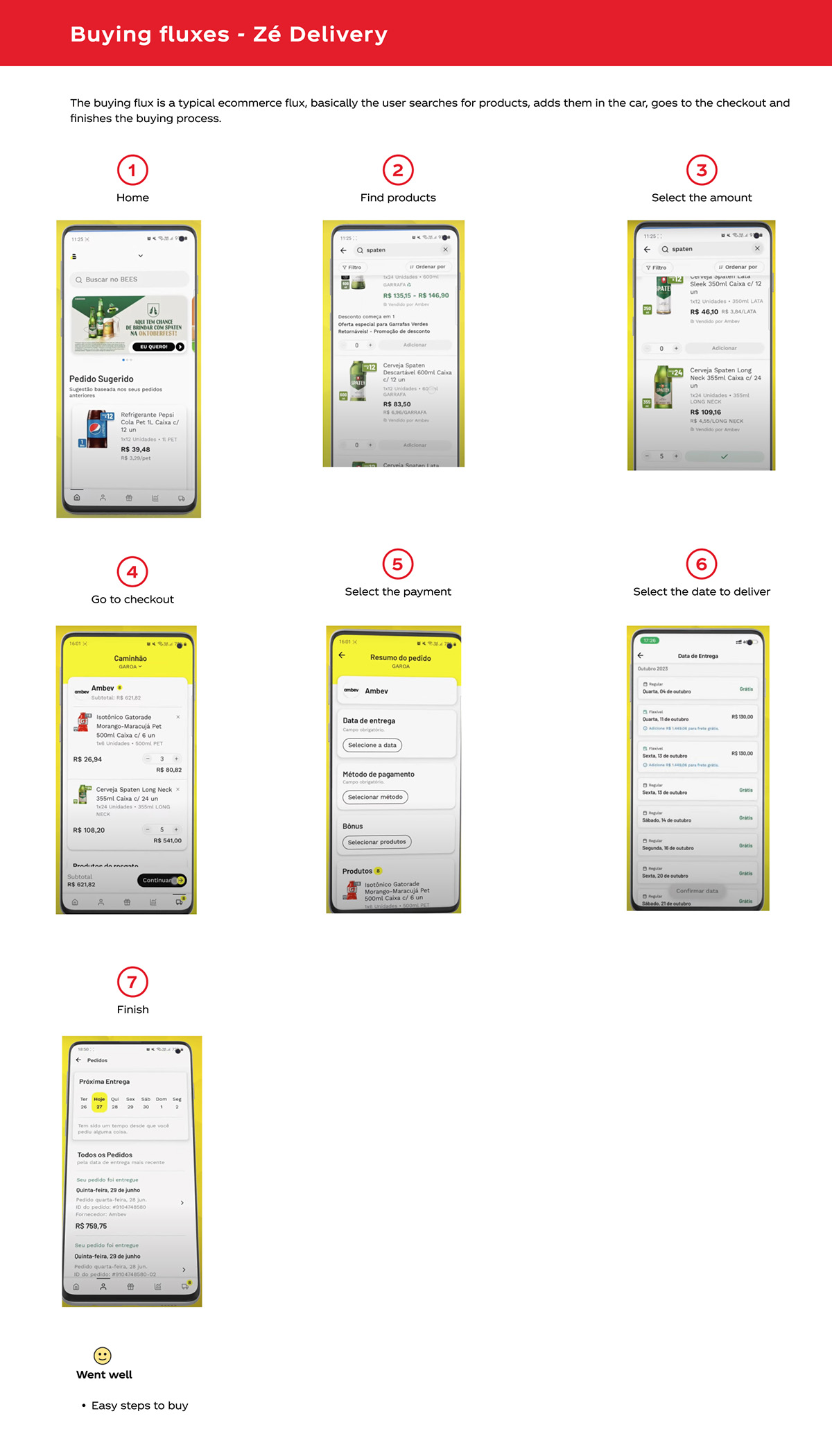
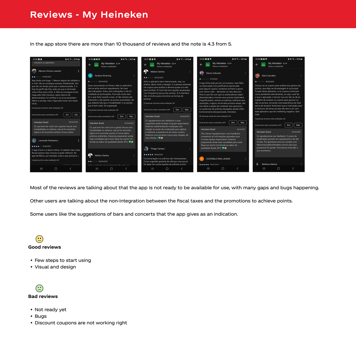
Items to be analyzed:What is, onboarding in the app, menu exploring, searching for products, user flows, promotions, tone of voice and checking about the reviews.
The competitive analysis revealed opportunities to implement the following features:
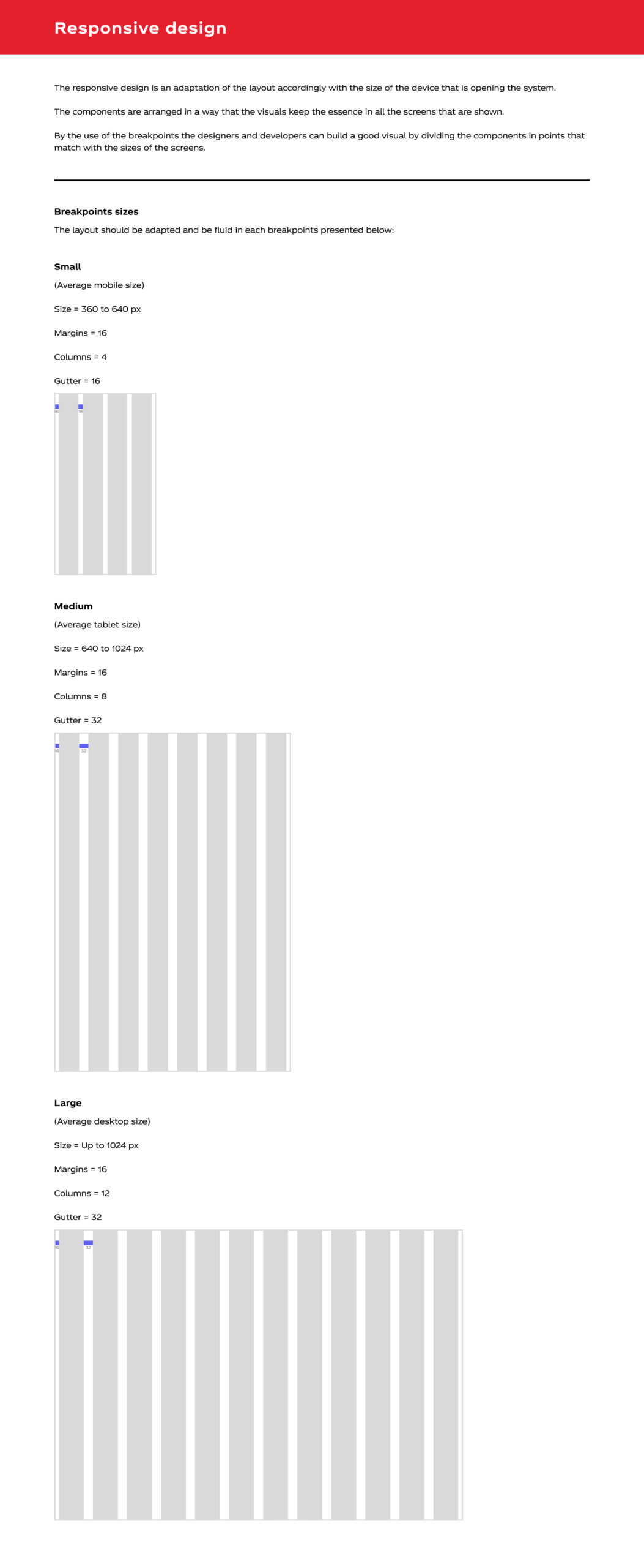
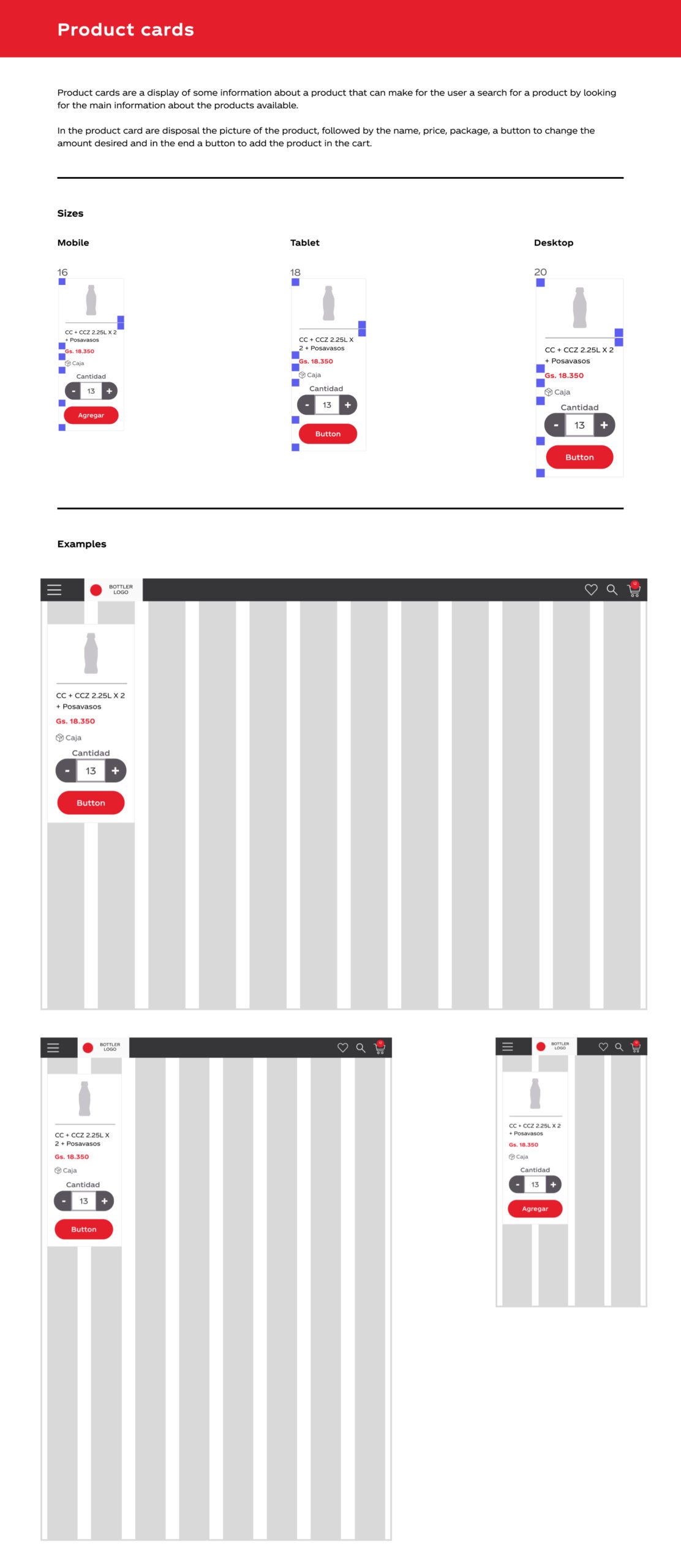
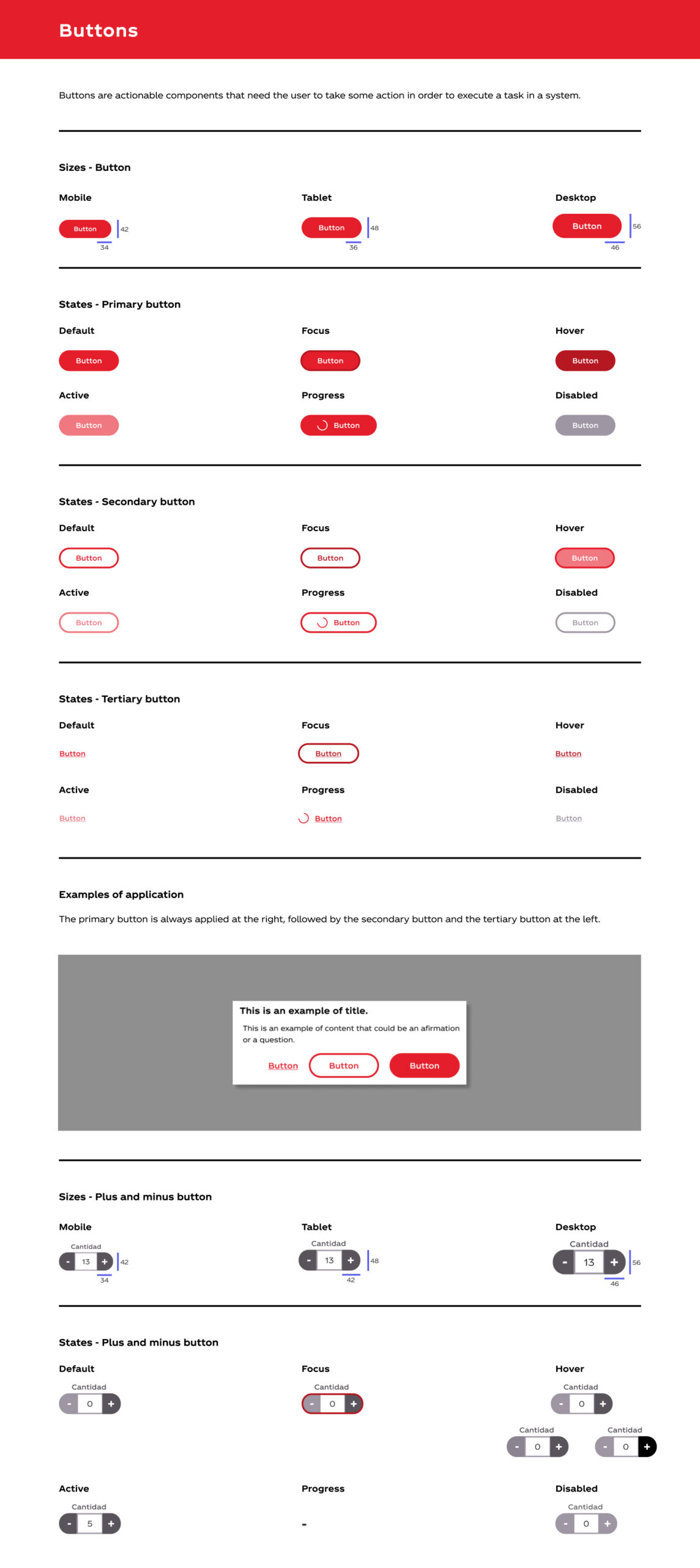
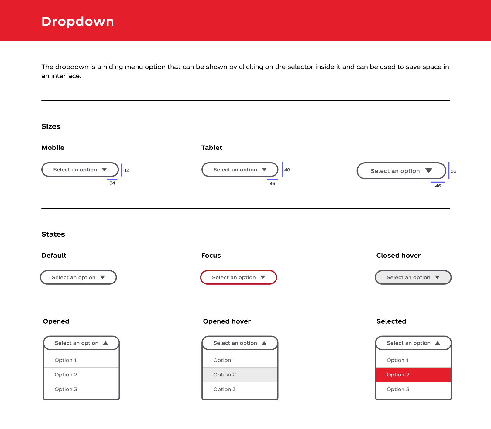
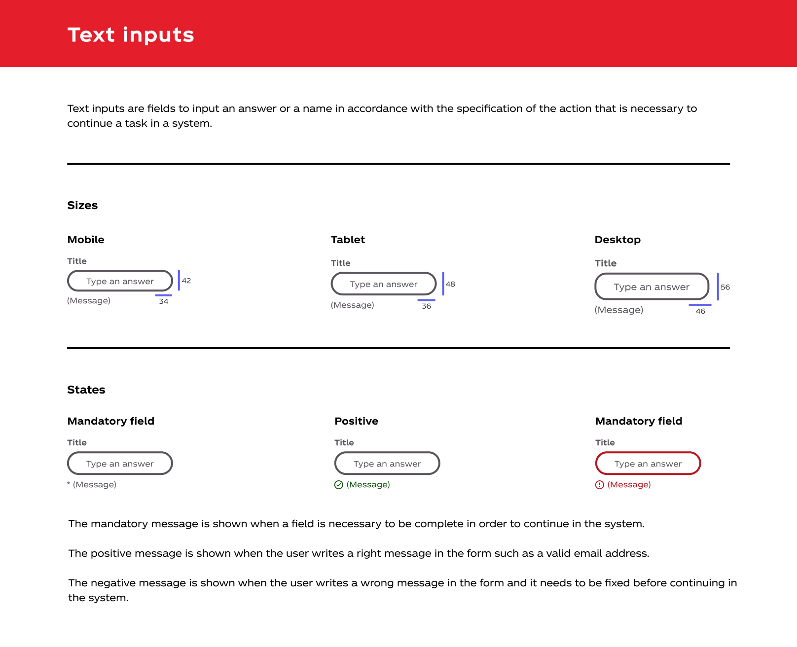
Design system
To ensure scalability across five countries, I created a comprehensive design system that standardized our component library.
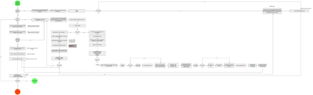
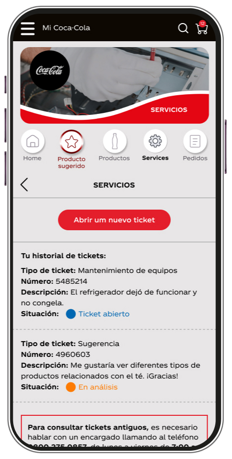
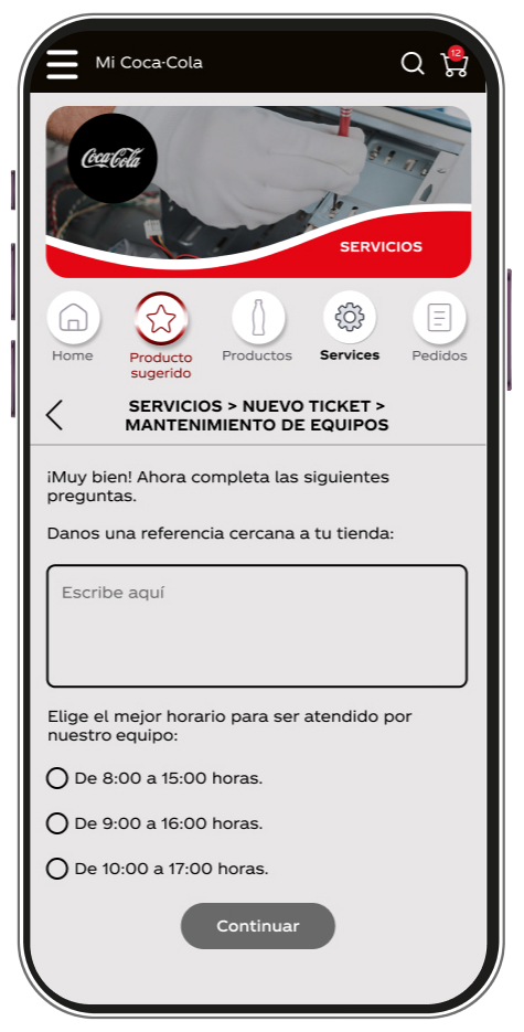
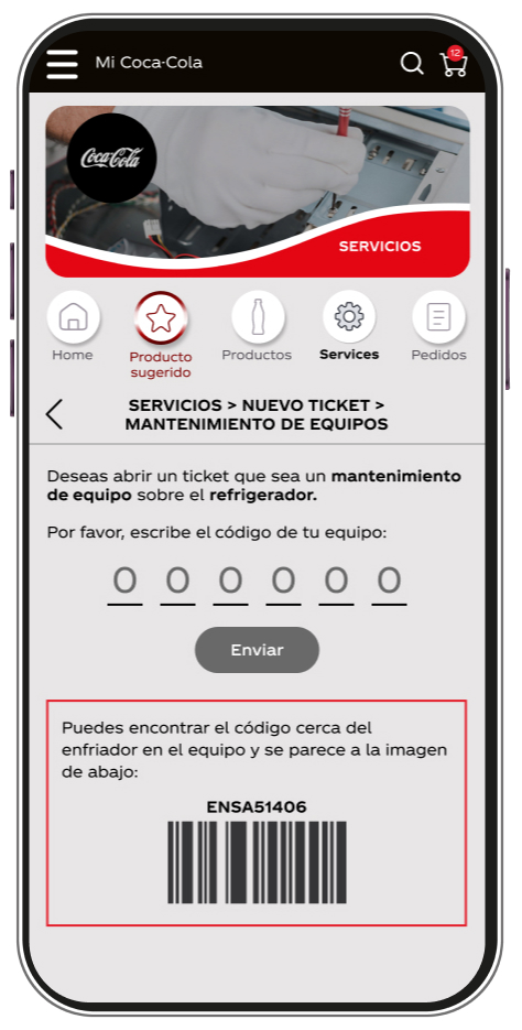
Task – Equipment maintenance
After completing discovery, I developed UX proposals to migrate the Equipment Maintenance feature from WhatsApp (Solar BR bot) into the Shopping Cart Latam app.
I began by analyzing the existing WhatsApp flow to identify inefficiencies. This analysis revealed opportunities to create a streamlined, app-native experience with fewer steps and reduced user friction.
Original flux for Maintenance Equipment - It needs to be short for the app
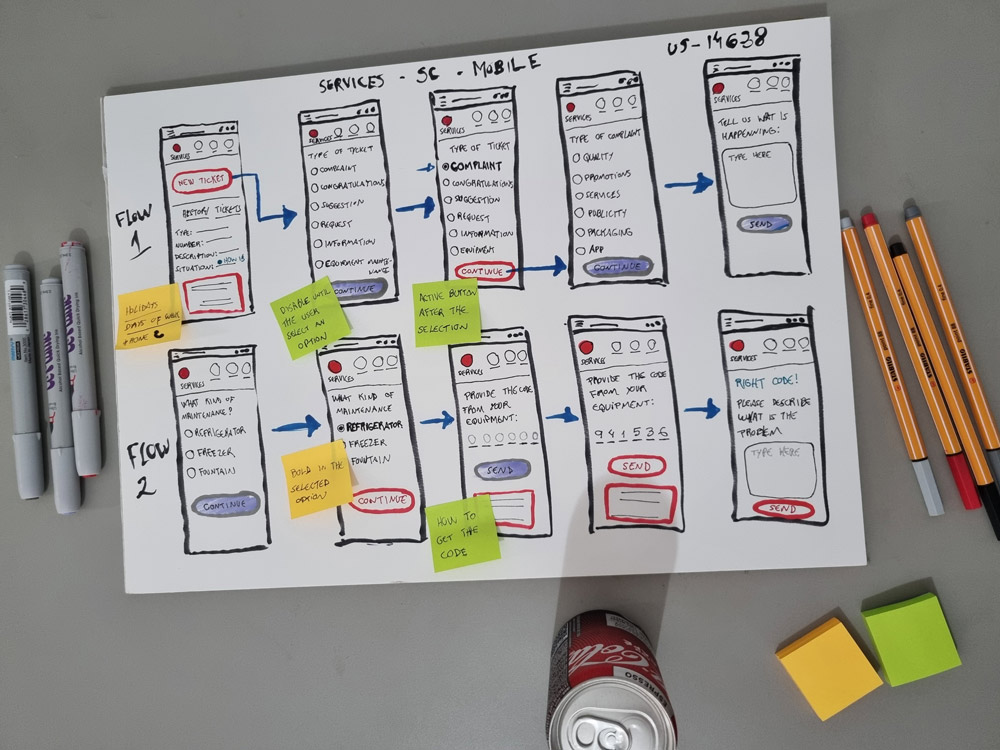
I start by sketching on paper for speed and flexibility, then translate concepts into low-fidelity prototypes for team review
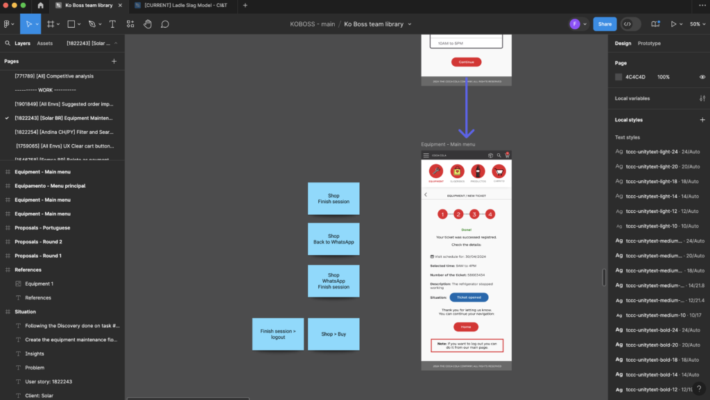
Once approved, I create high-fidelity prototypes with detailed developer notes to streamline handoff.
I created a video walkthrough demonstrating the design process and interactive prototype:
All delivered tasks
During the period working together we achieved the following features:
Promotions section;
Suggested order page;
Maximum amount in the cart feature;
New color palette for the system;
Design system;
Branding;
Naming;
Erase product option
Maintain Quantity After Adding to Cart;
Include information about product package on the system;
Boleto as payment method;
UX Clear cart button on mobile view could be adjusted;