The old institutional page of Ourofino Agrociência was very simple and with little content.
Through a survey with the public and stakeholders, I developed a complete page with the information collected.
Tools used: Adobe XD, Miro, Whimsical, Photoshop
Timeline: 4 weeks
Team: Marketing and digital
Problem
Companies in the agriculture sector need to show a consistent history in order to obtain loans or for investors and suppliers to feel secure in doing business.
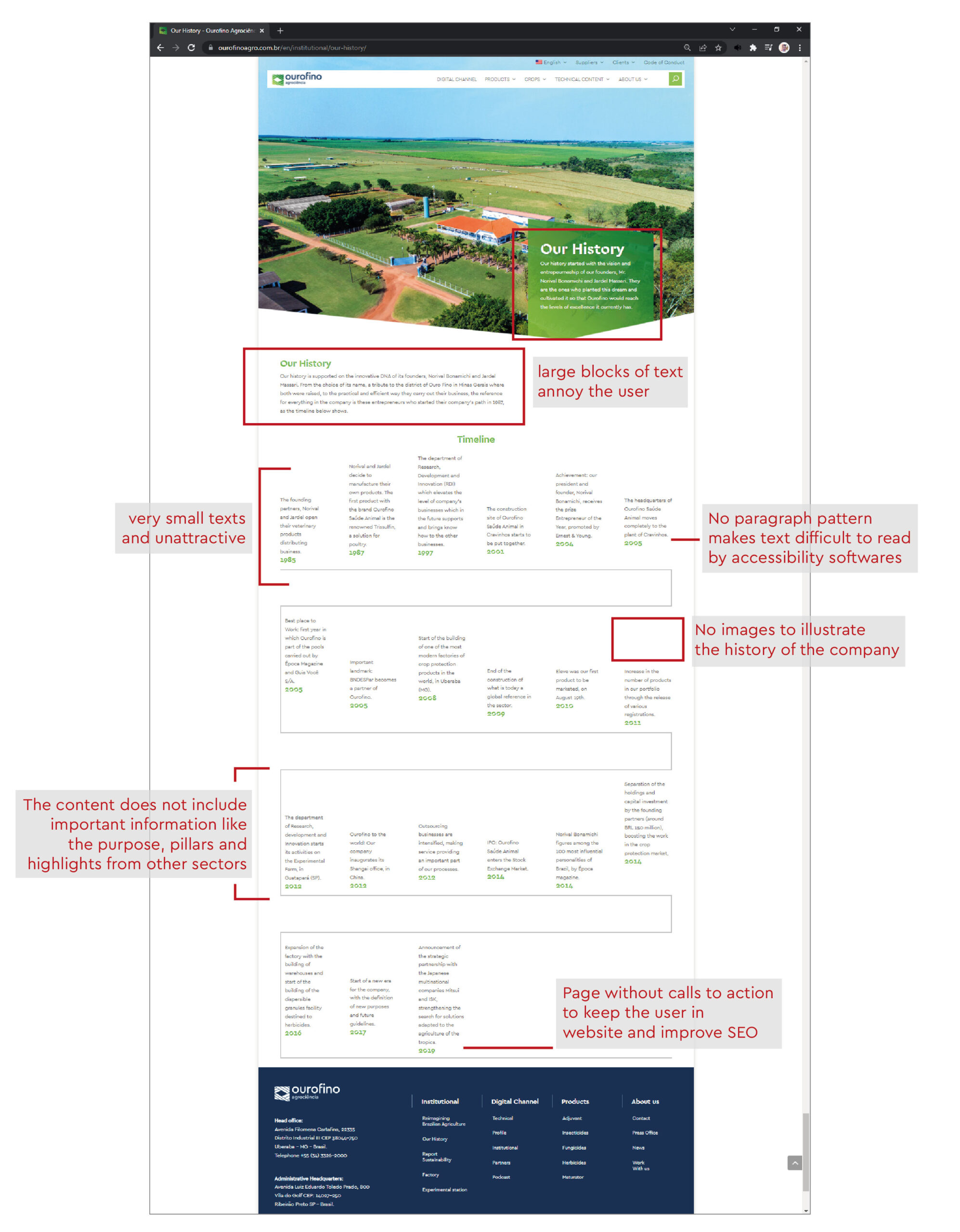
As we will see in the old institutional page of Ourofino Agrociência, it was unattractive and lacked information.
Solution
Develop a complete institutional page that shows the history of the company and its differentials.
Use UX and UI design techniques to improve the user experience and modernize the look.
Old page analysis
As mentioned earlier, the old page had very little content and some UX design issues, noted below.
Competitor analysis
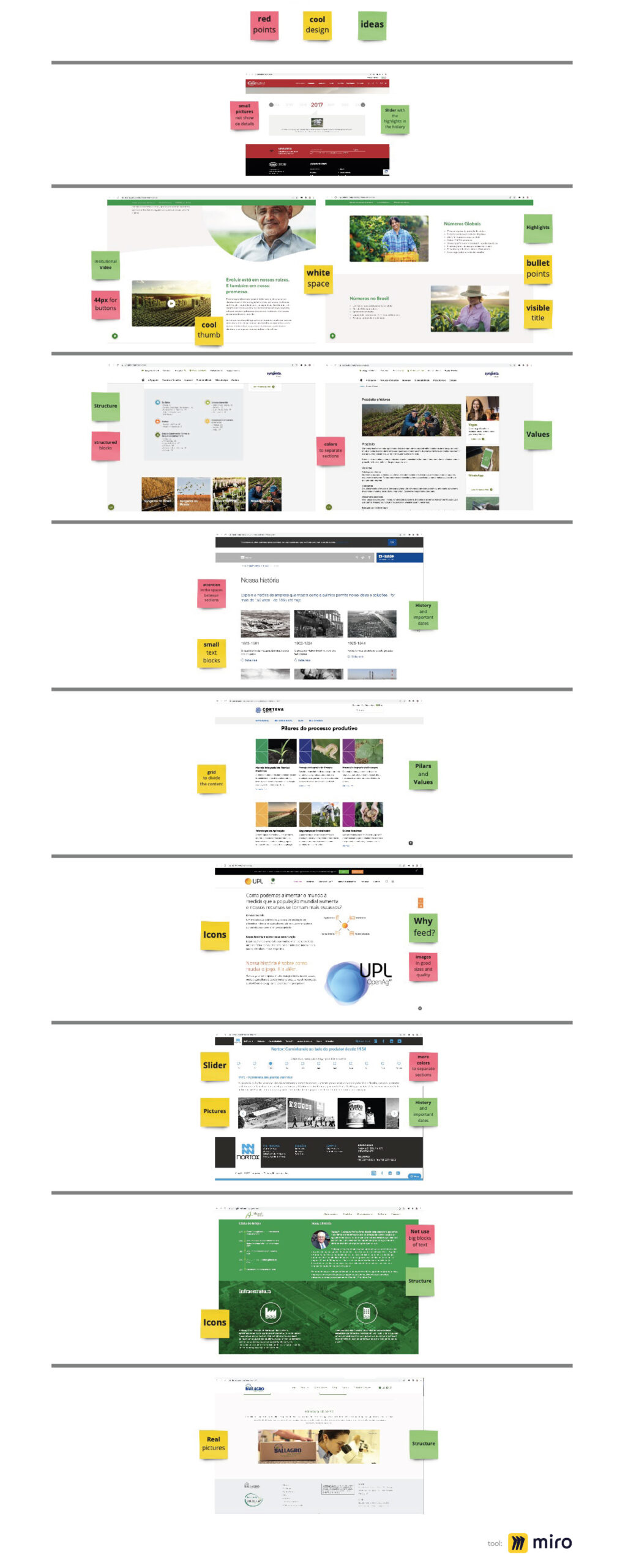
After analyzing the institutional page of Ourofino Agrociência, I did a research on how competitors structured their pages, looking for insights and elements that presented value.
Research
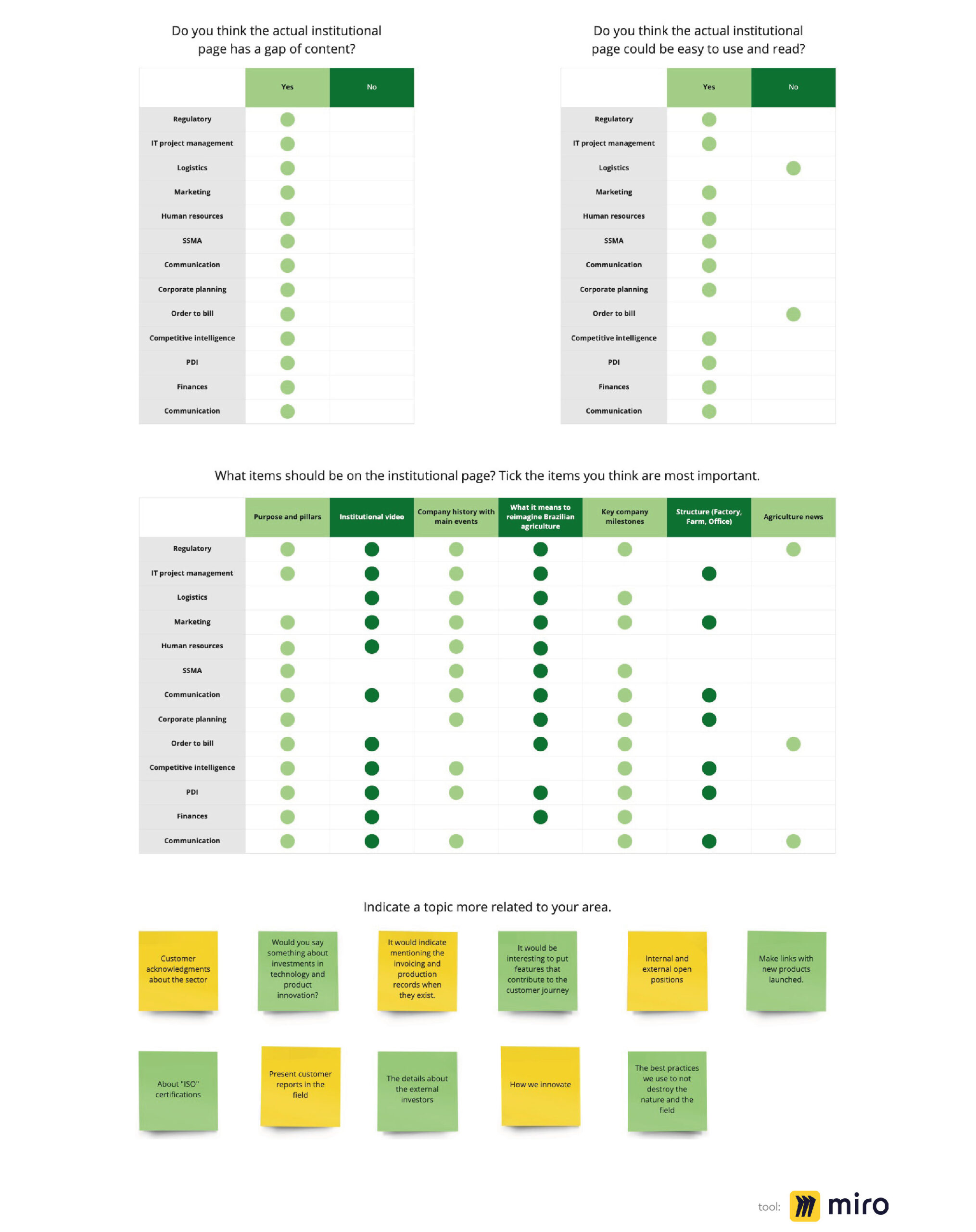
To better understand the needs of the institutional page, I did an internal survey with several employees of the company to see their vision about the old and the new page.
2×2 matrix
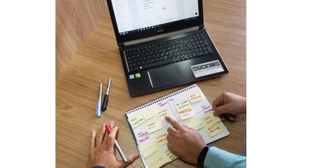
To define the topics that would be developed on the institutional page and the prioritization, I did the 2z2 matrix with the manager.
Users
The institutional page serves not only to present the company’s history to customers, but also to banks, potential investors and suppliers who may come to do business.
Thus, the content needs to make sense to all these stakeholders and include the founders, finance, product development, logistics and commercial parts.

Information architecture
Together with the digital content team, we developed the following topics that would be addressed on the new page.
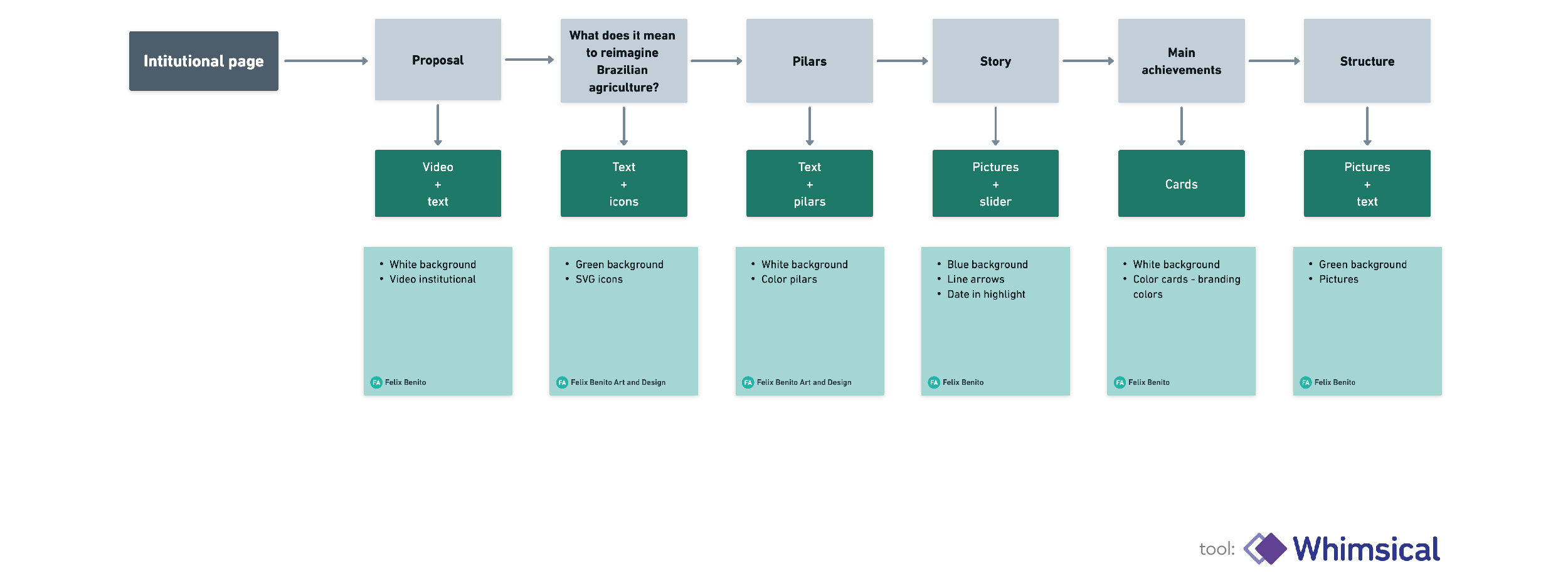
Sketches
With the contents defined, we started to study the best way to present these materials in an attractive way, which solves the UX and accessibility problems identified in the old page.
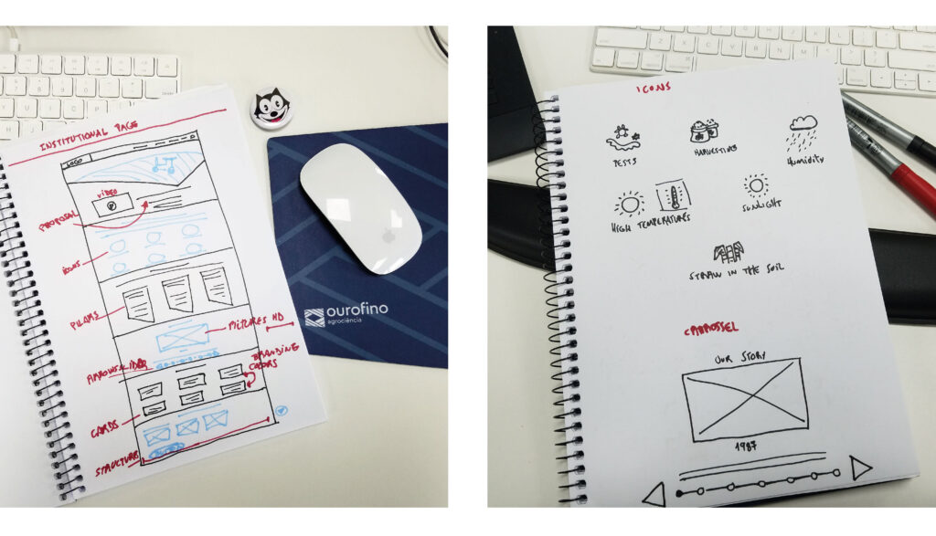
Wireframe
We’ve structured the page in a way that tells the company’s story in large sections and presents the relevant information to users as they scroll down.

Design
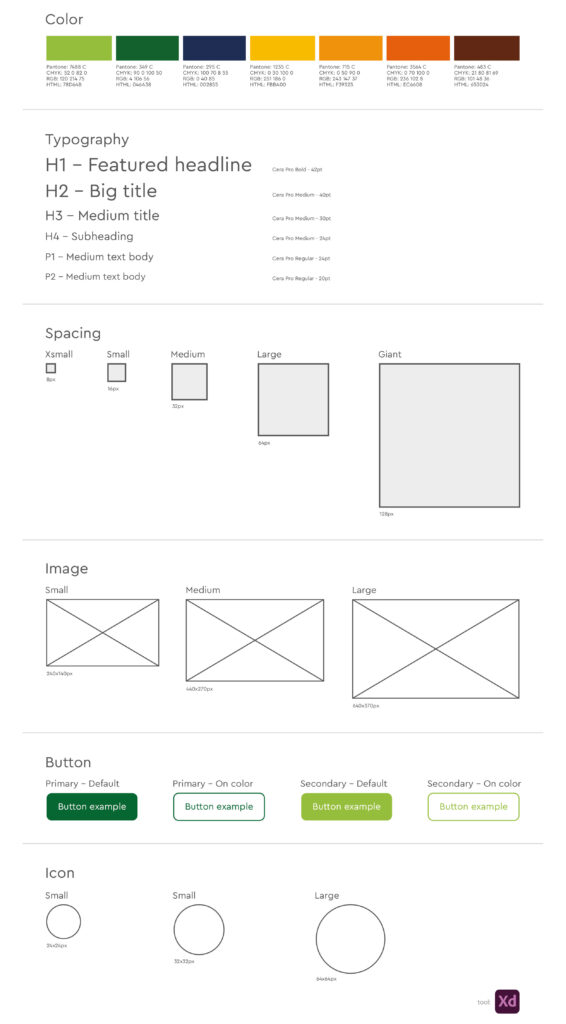
The design follows the principles of branding, but some definitions were created to maintain the standard between the elements.
Final result
As a final result, the page was complete, very attractive visually and with relevant content.
The division between sections and cards made the material dynamic and easy to understand by any user.

Validation test
To find out if the page met the expectations and objectives, I performed a validation test with the stakeholders who helped to assemble the structure. Bellow are the comments:
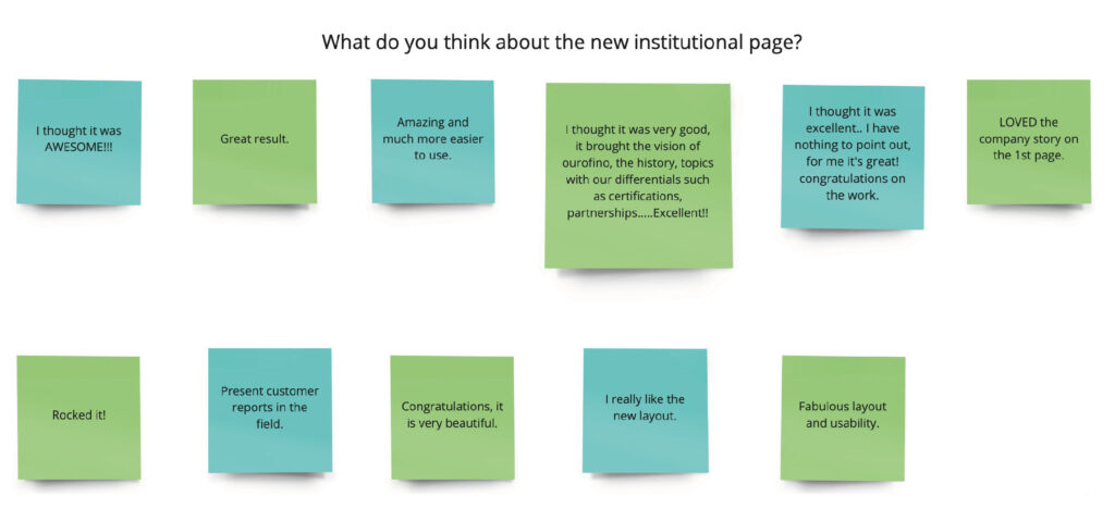
Results
— 48% increase in page traffic
— Usability tests showed that the page is easier to access and the contents to be read
— According to the stakeholders, the page has content that represents the main points of the company
What did I learn?
— That the company’s employees enjoyed participating in the research process and helping to build the institutional page
— Each sector can contribute to the growth of the whole
— Hear the opinion of other sectors on the development of the project
— A complete page that complies with accessibility guidelines has more users

