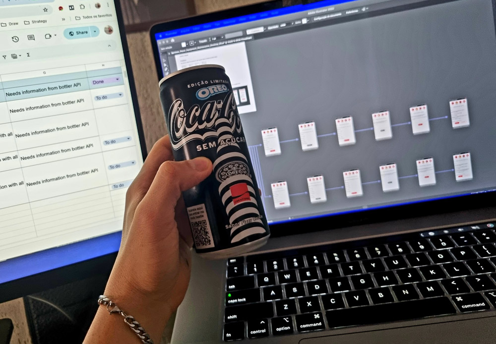
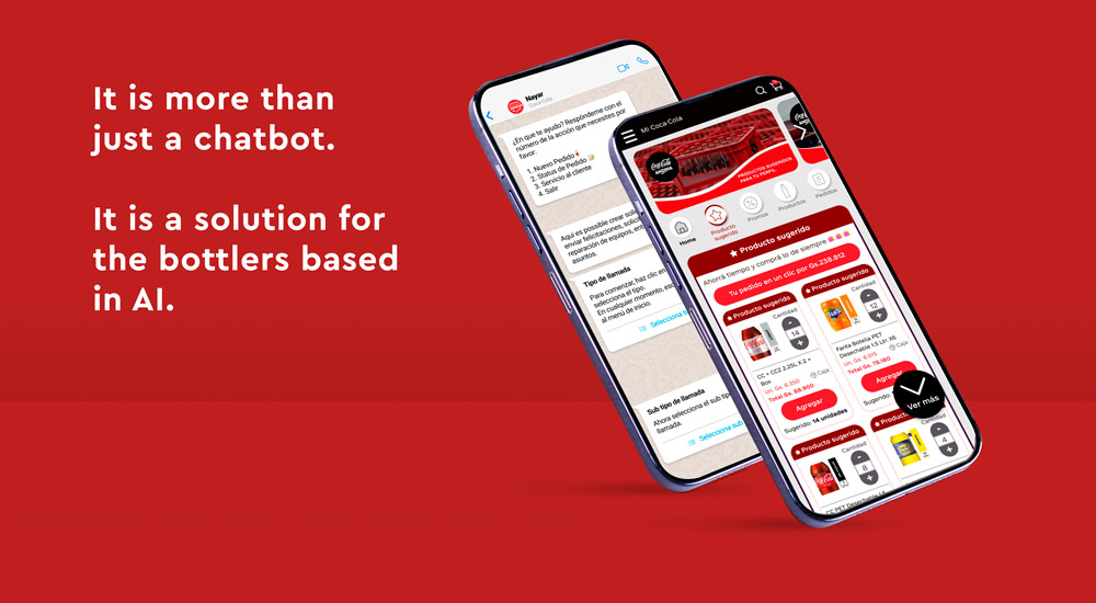
Context: Coca-Cola (Latam) is the most recognized brand in the world, selling around 2.2 billion products daily, a truly impressive brand. As a product designer, I am working in order to facilitate the buying and selling process between bottlers and the distributor market through web applications, chatbots, among other communication systems.
Tools used: Figma, Miro, Illustrator, Photoshop, Azure and Teams.
Timeline: 12 months.
Team: 26 people including me as the product designer, managers, developers and business analysts.
Project management: Lean UX and Agile.
Countries applied: Mexico, Paraguay, Chile, Argentina and Brazil.
Stakeholder map
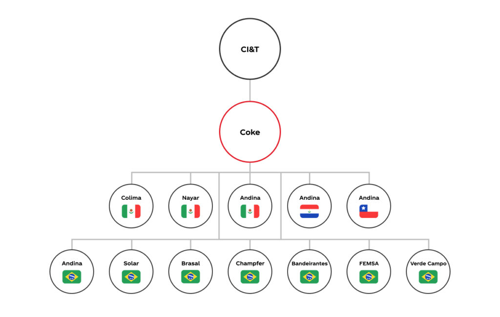
Our project has many stakeholders involved as managers, business analysts, developers and the owners of the bottlers.
In order to understand the flux to present the work and get the approvals I created the stakeholder map with all the bottlers and countries involved.
Competitive analysis
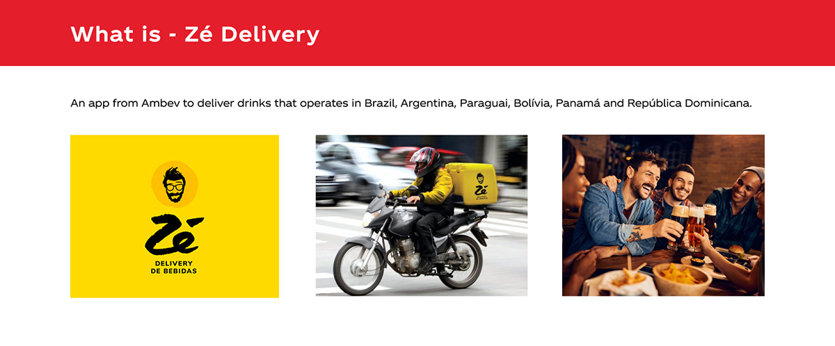
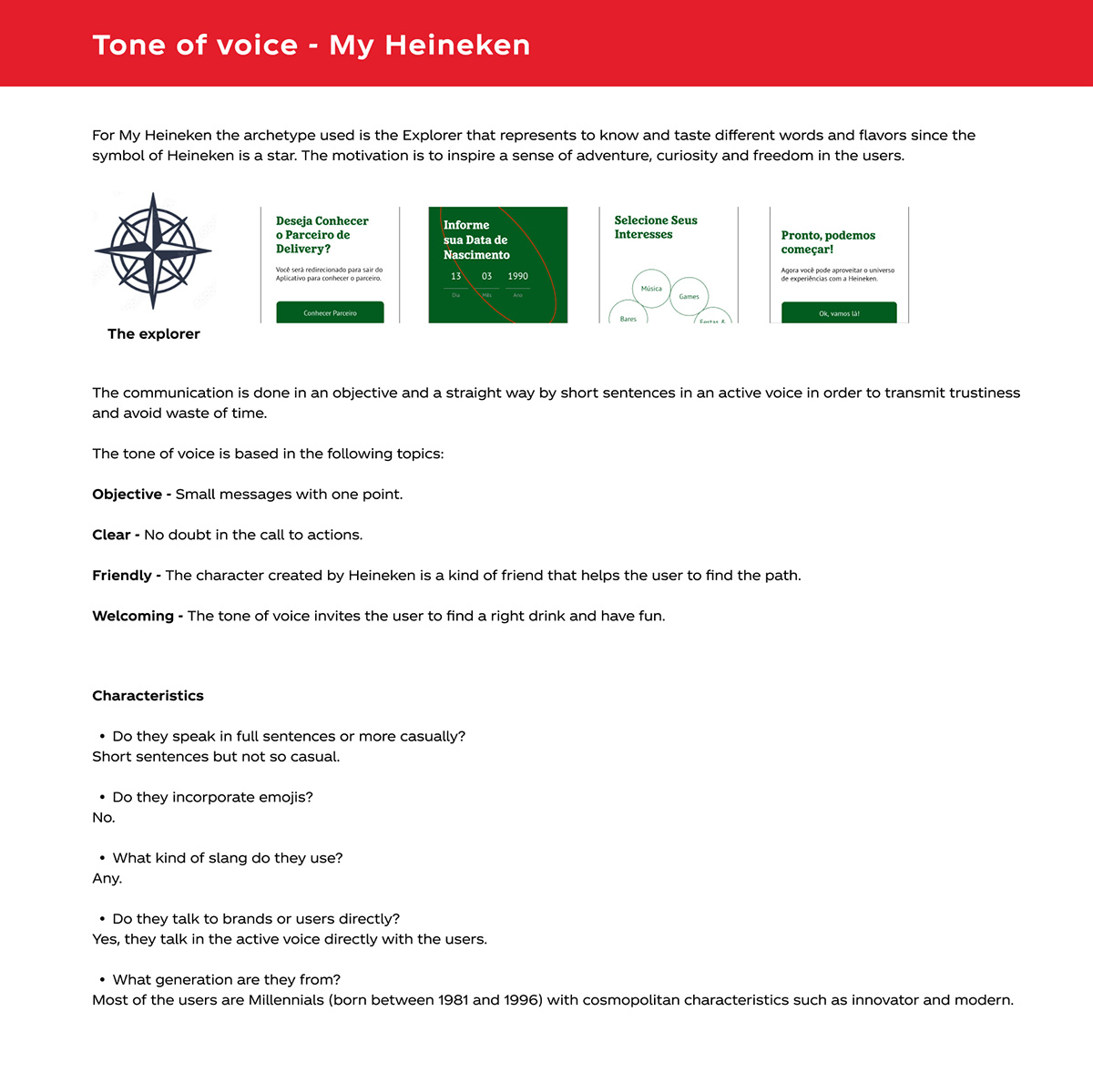
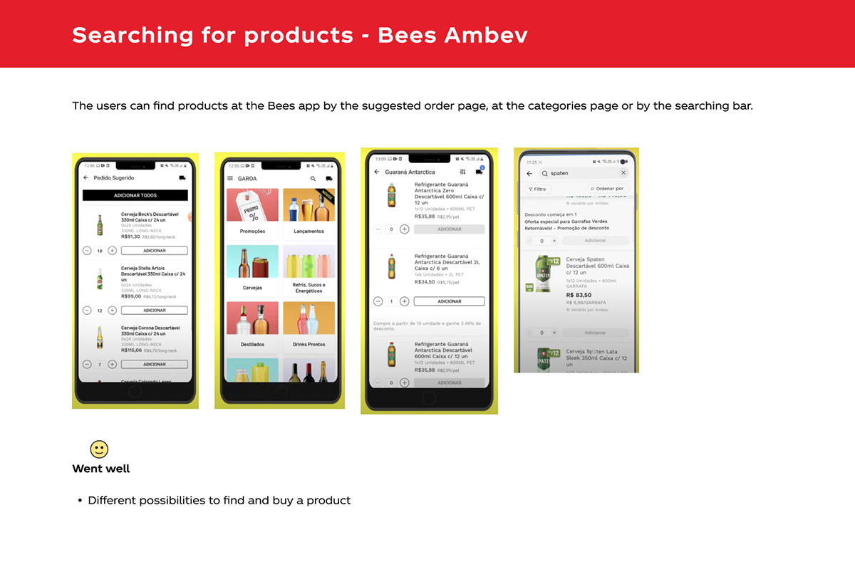
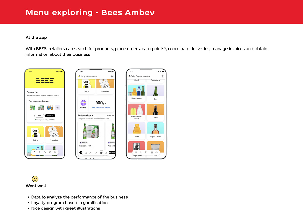
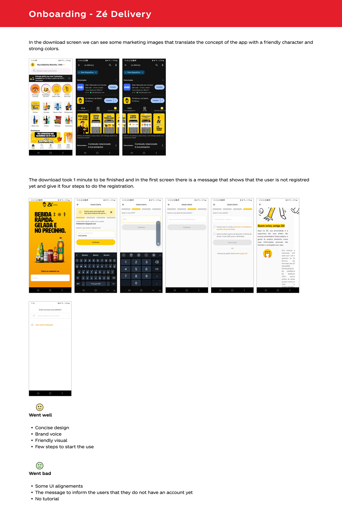
To do a competitive analysis I listed some possible direct and indirect competitors in order to get insights for possible actions and improvements.
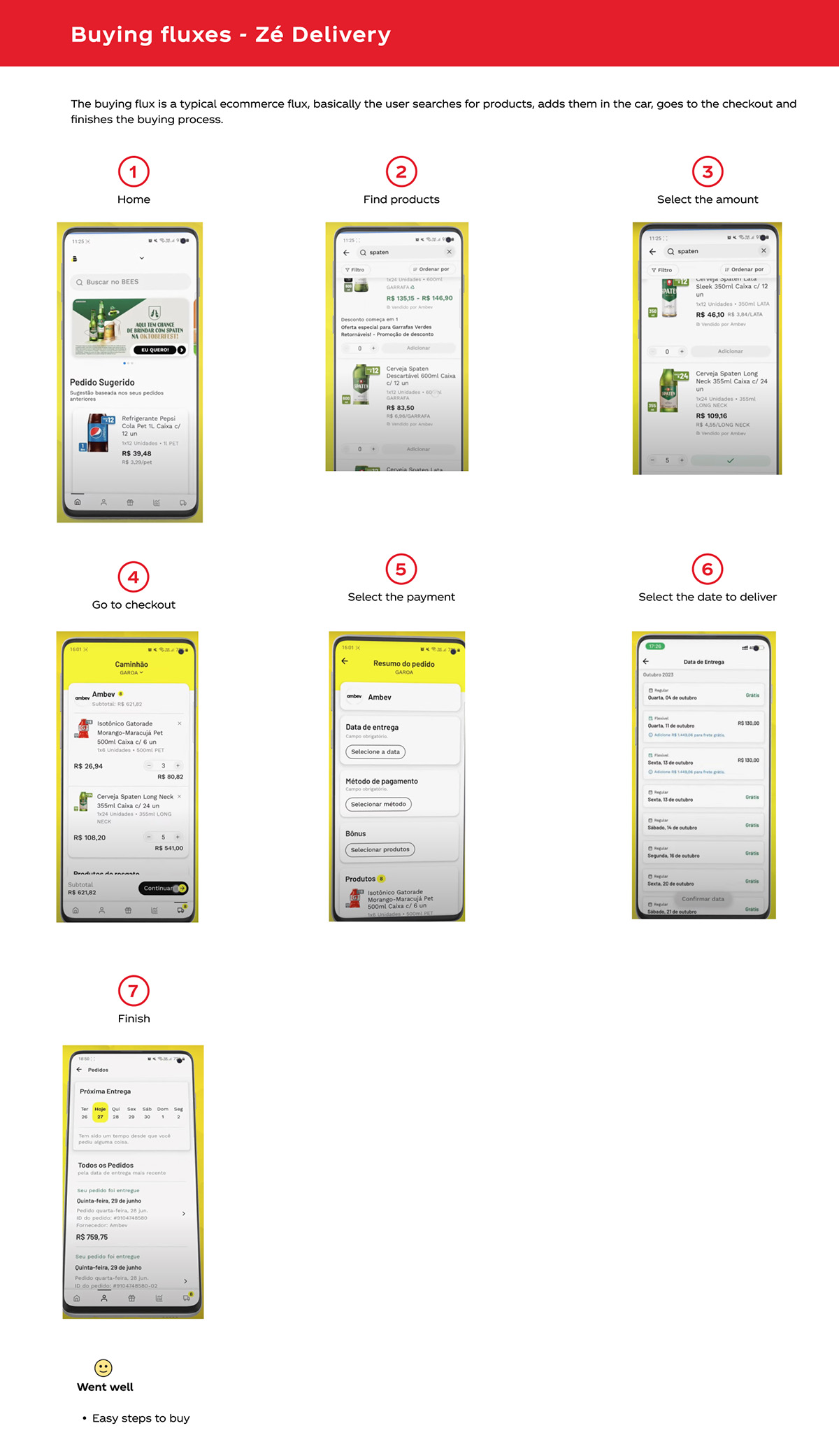
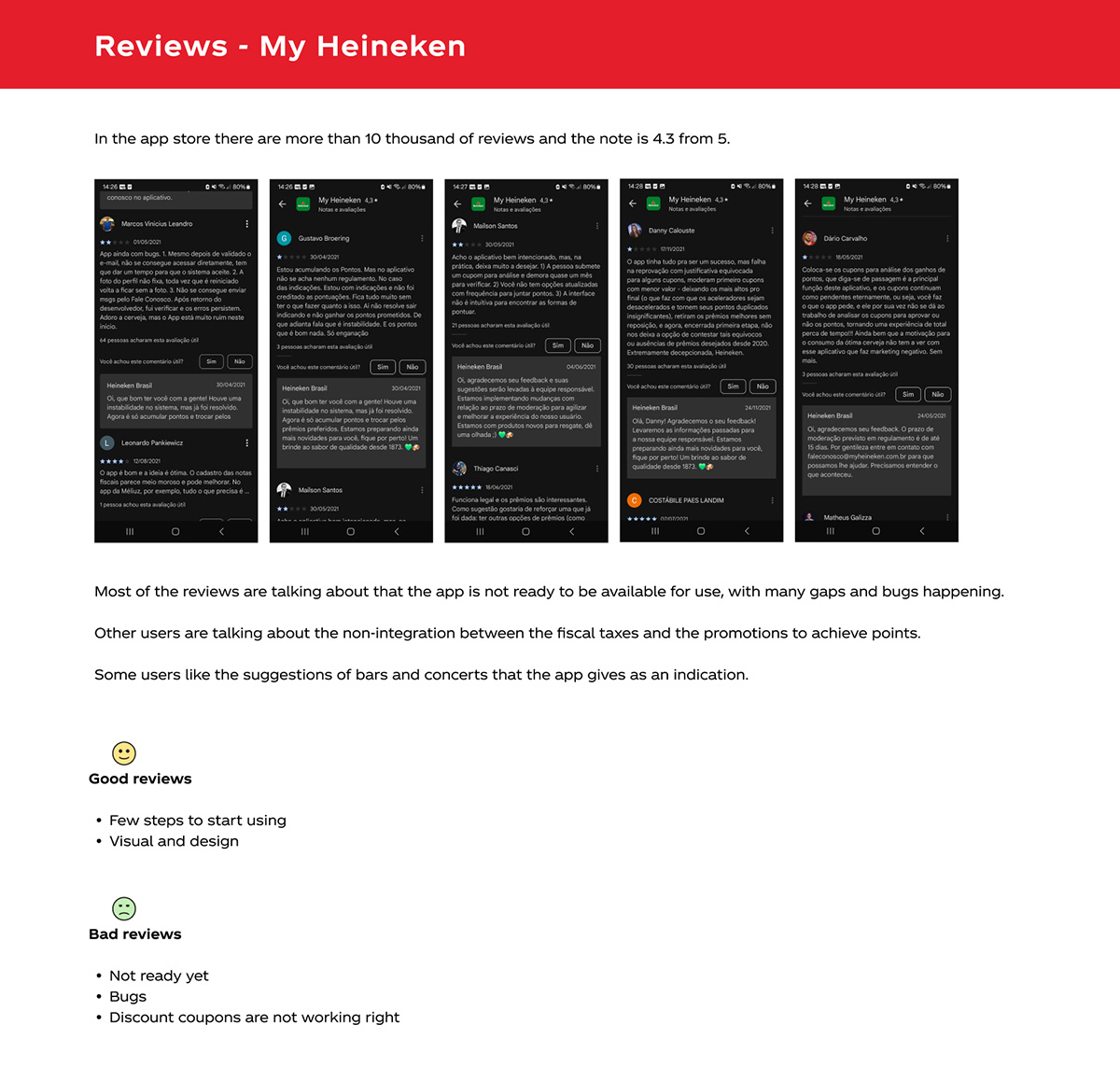
Direct competitors: Zé Delivery, Heineken app and Bees Ambev.
Indirect competitors: Ifood and Uber Eats.
Items to be analyzed: What is, onboarding in the app, menu exploring, searching for products, buying fluxes, promotions, tone of voice and checking about the reviews.
UX scorecard analysis
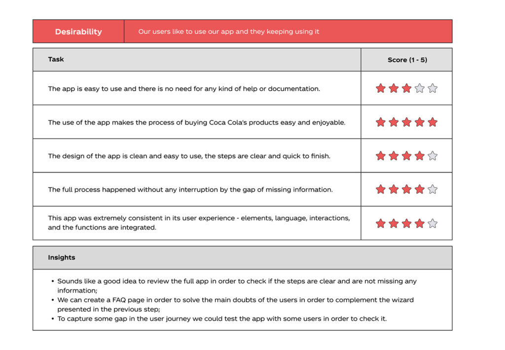
My work started as analyzing the current model of achieving clients and how easy it was for them to buy from our app.
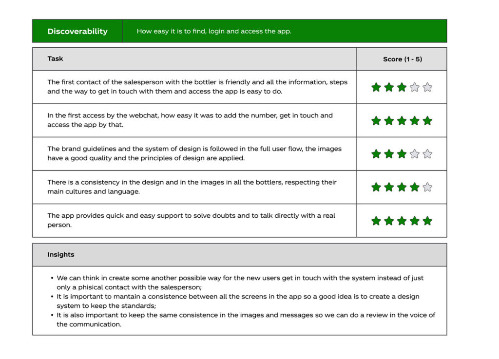
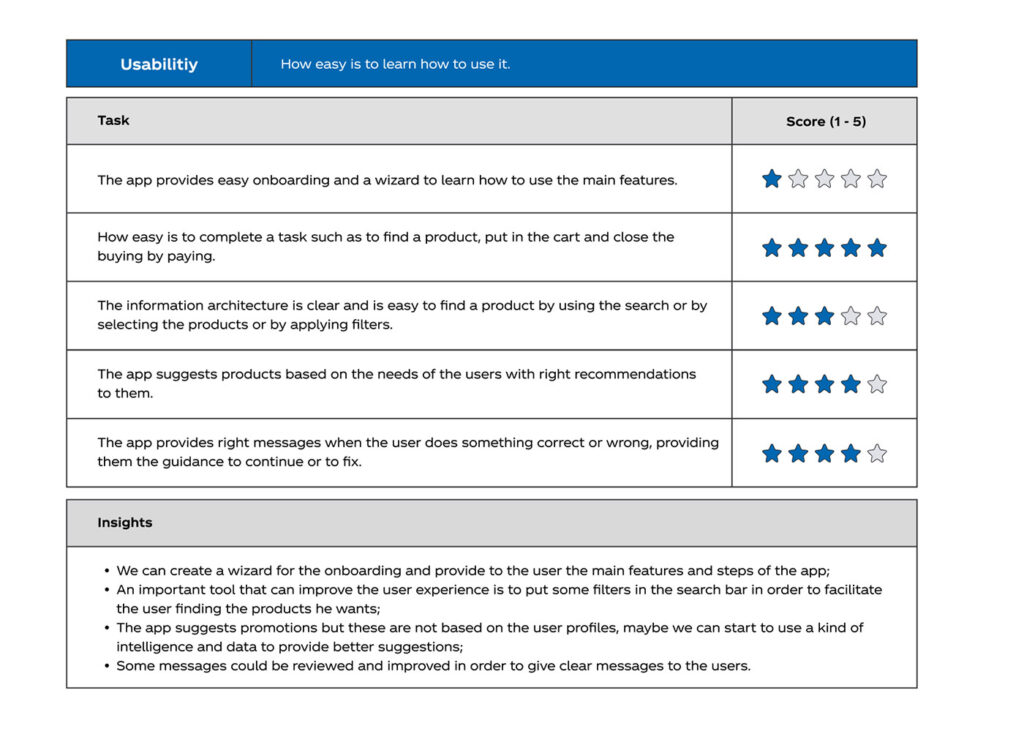
To do this analysis I used the UX scorecard that is a combination of based on SUS (System Usability Scale) which is a normed instrument that measures usefulness and usability and also combined with TAM (Technical Acceptance Model).
With that model we can measure the three main points of the weakness and improvements that we can do in the app: discoverability (how easy it is to find, login and access the app), usability (how easy is to learn how to use it) and desirability (our users like to use our app and they keeping using it).
The measure is calculated in a ratio between 1 (not went well) to 5 (went amazing).
Design improvements
The old version had some design issues to solve, I did an analysis and bring a proposal in order to improve the application.
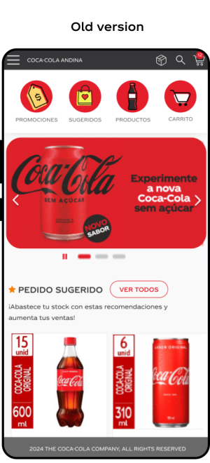
Problems identified:
- Design with old style
- Problems of contrast in colors, fonts, spacing and boxes
- Product without a specific branding
- Different design patterns between the pages
- Low highlight for the products
- Different padding in components
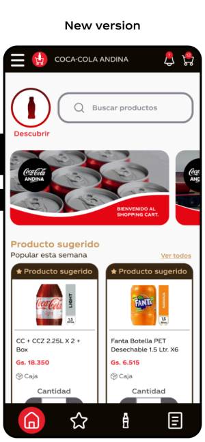
Improvements with the new version:
- Modern design
- Contrast accordingly with the WCAG guidelines
- Branding and a logotype
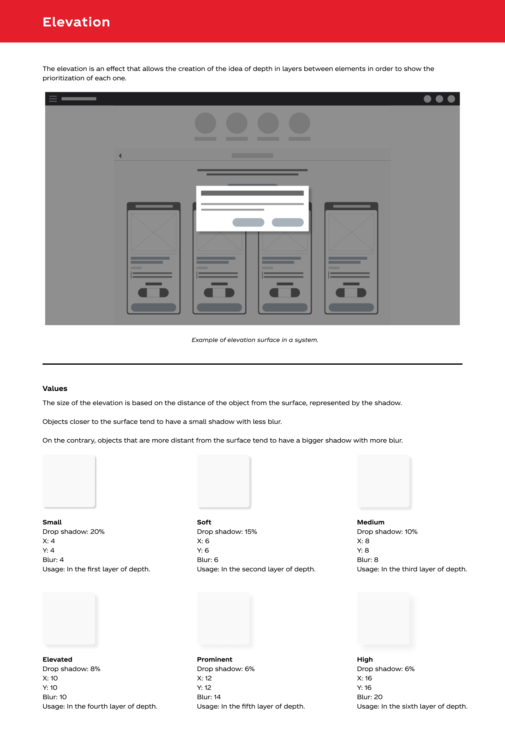
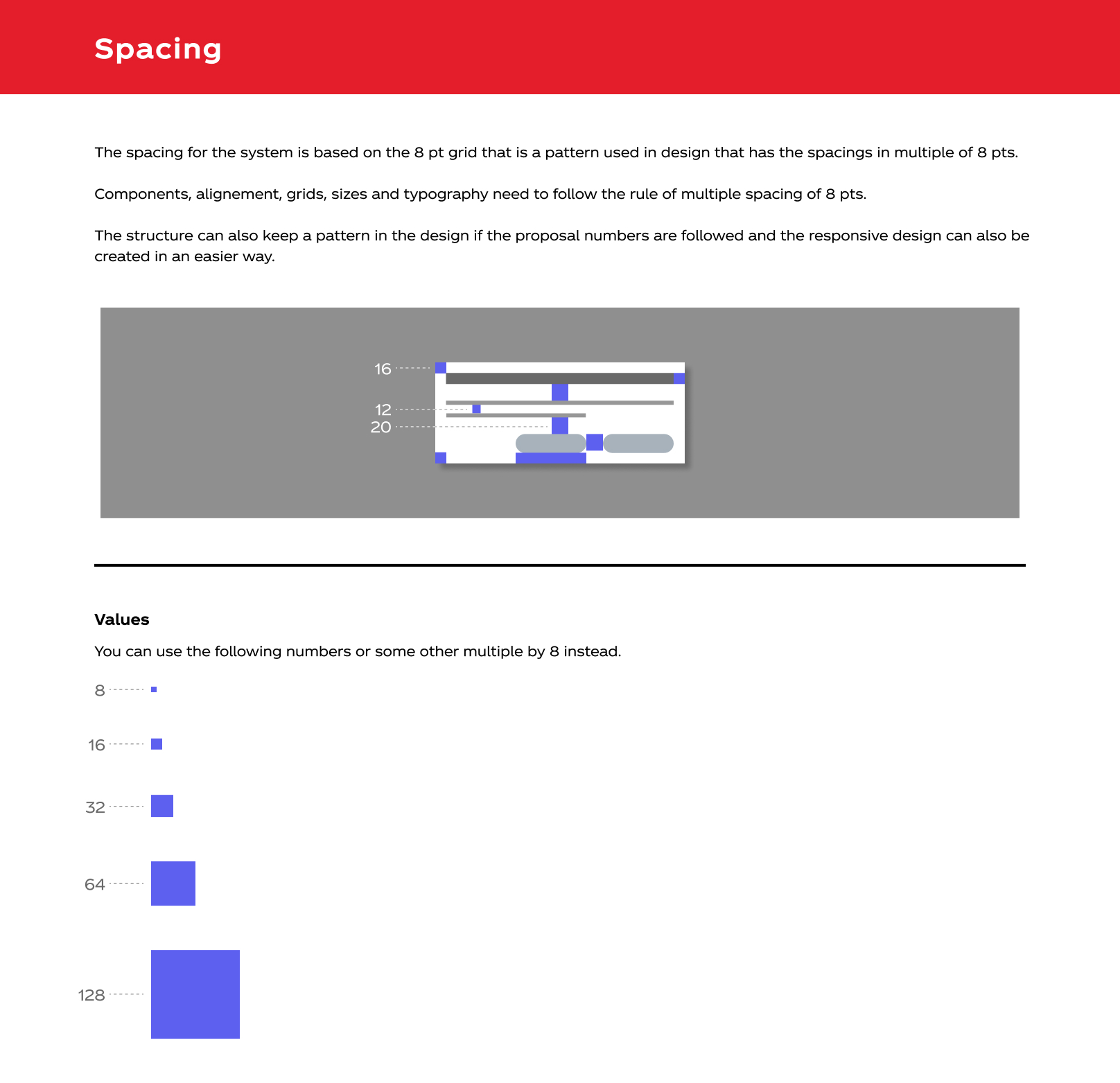
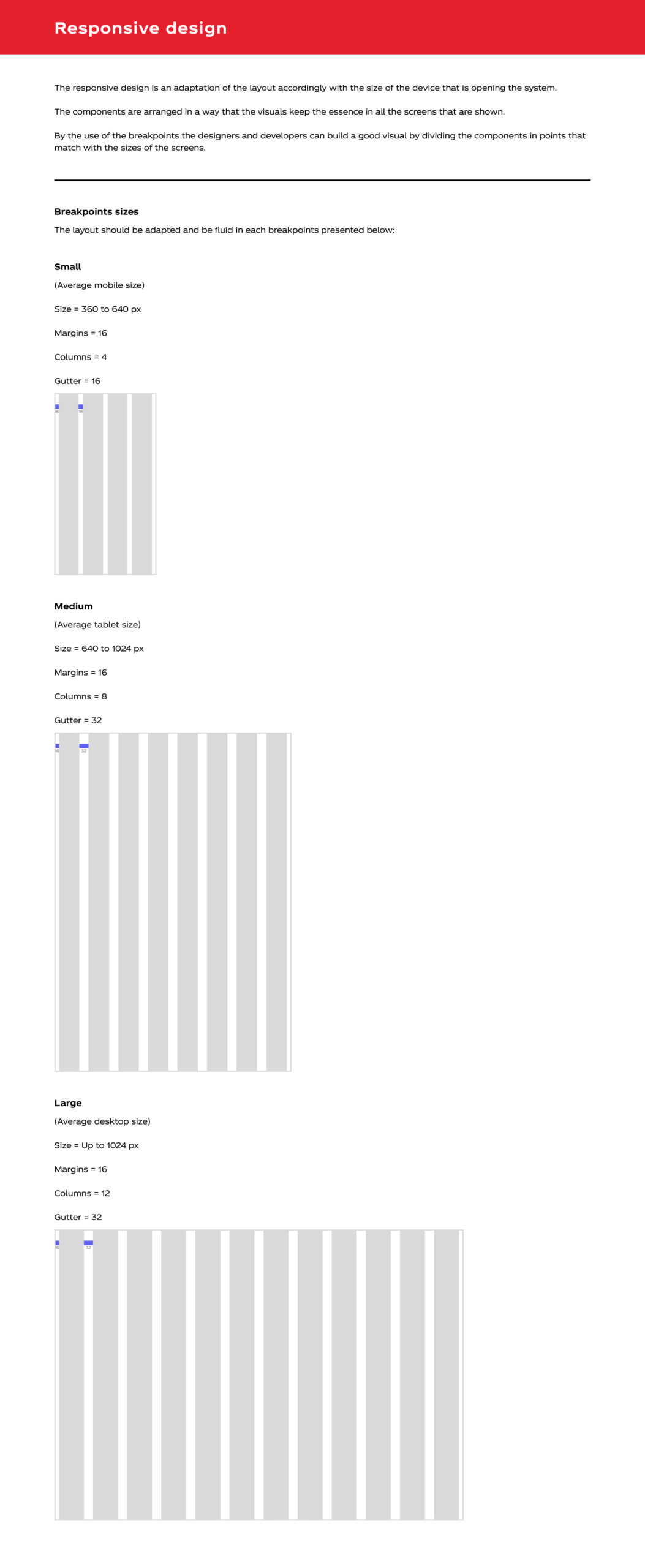
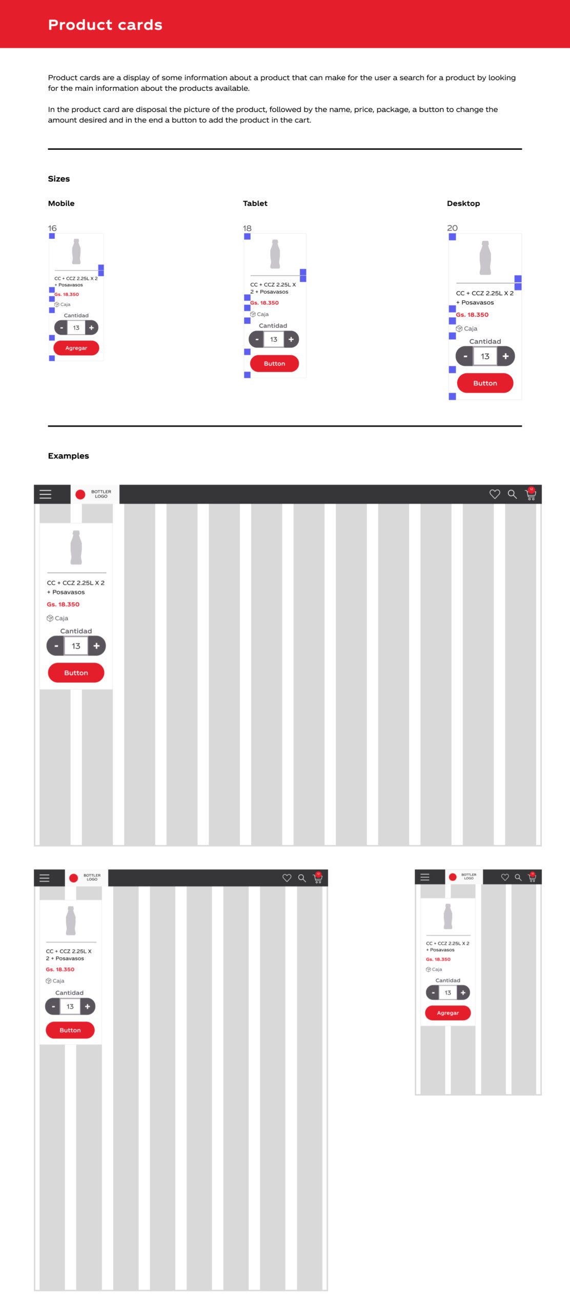
- Design system to create a strong pattern in the pages
- Easy to find products by the new search bar
- Good highlight for the products
- Marketing improvements through discovery (similar to stories)
- Padding adjustment in all pages
Design system
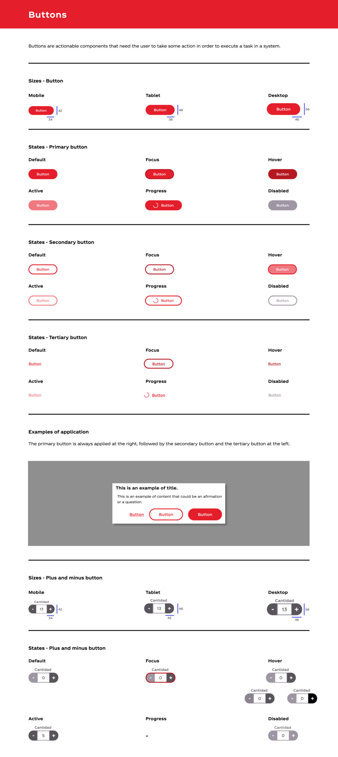
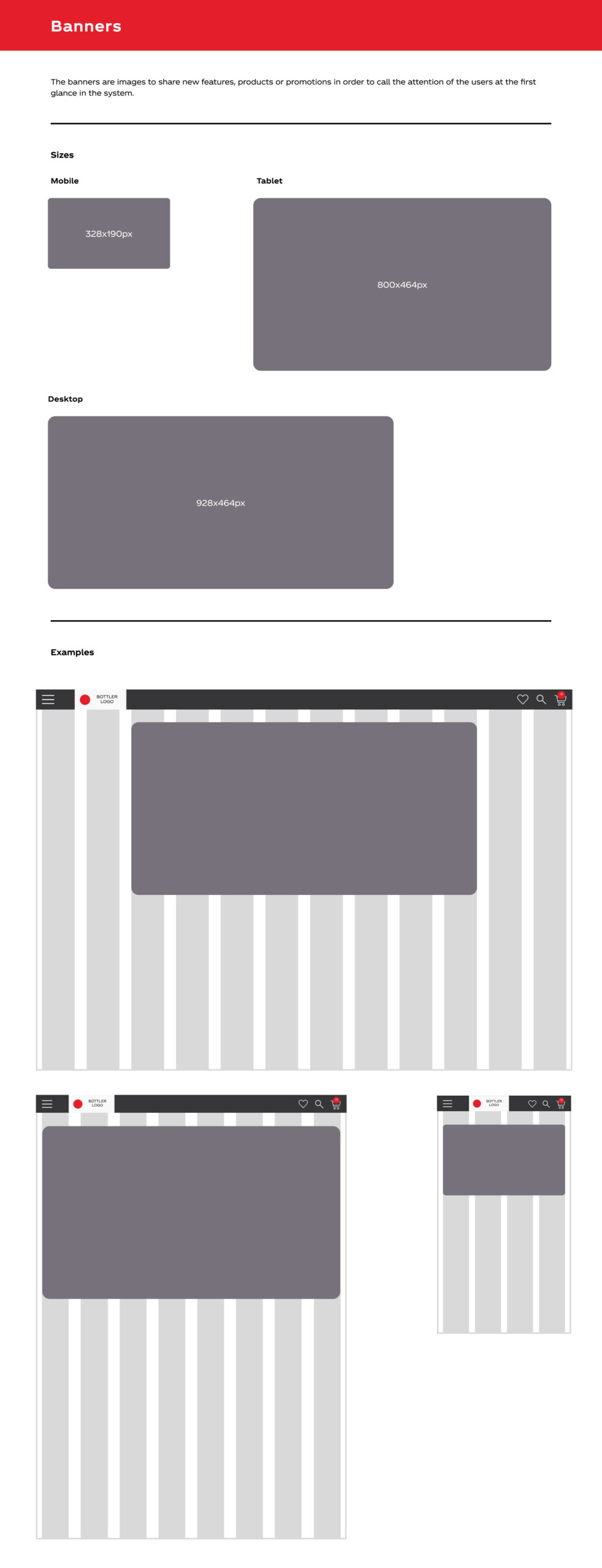
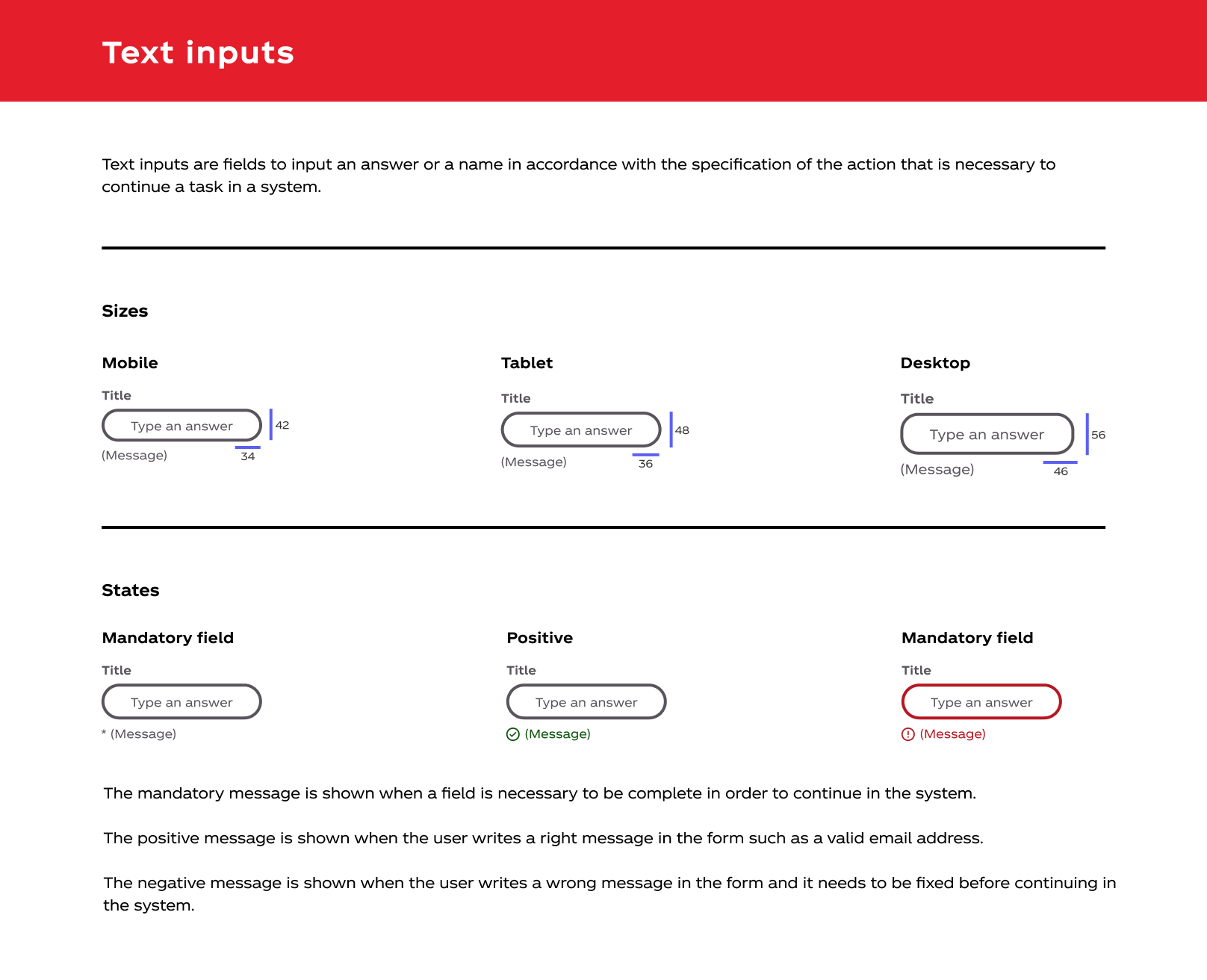
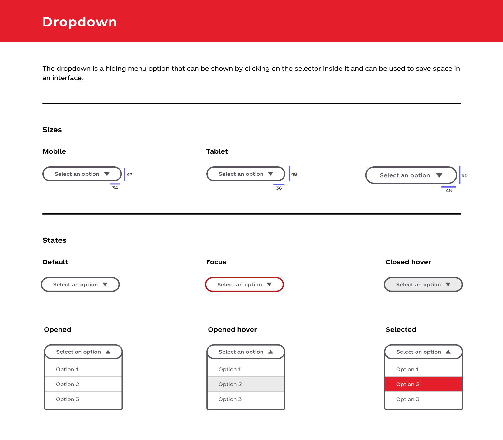
There were some design inconsistencies in the different Shopping Carts from the different bottlers.
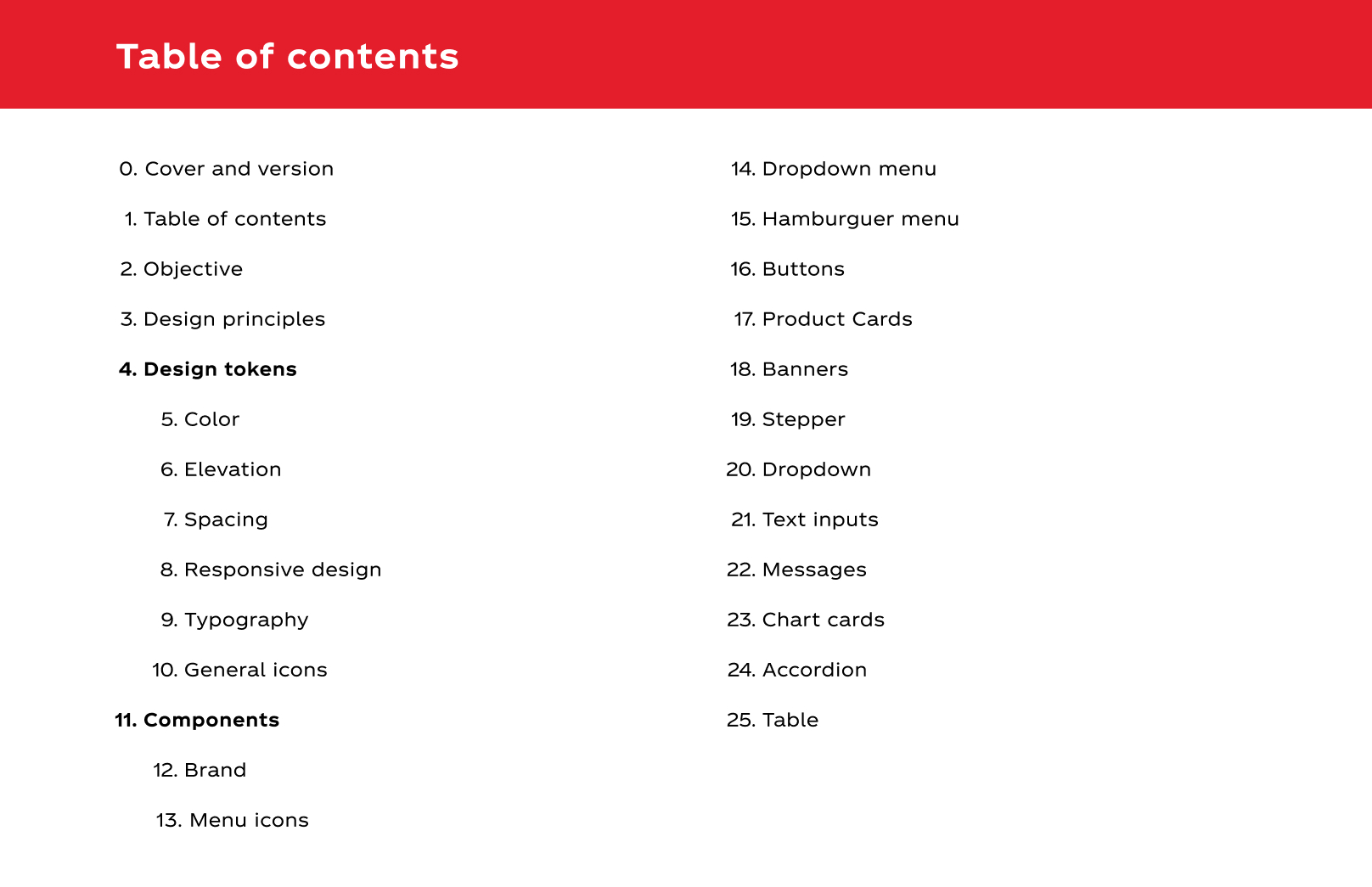
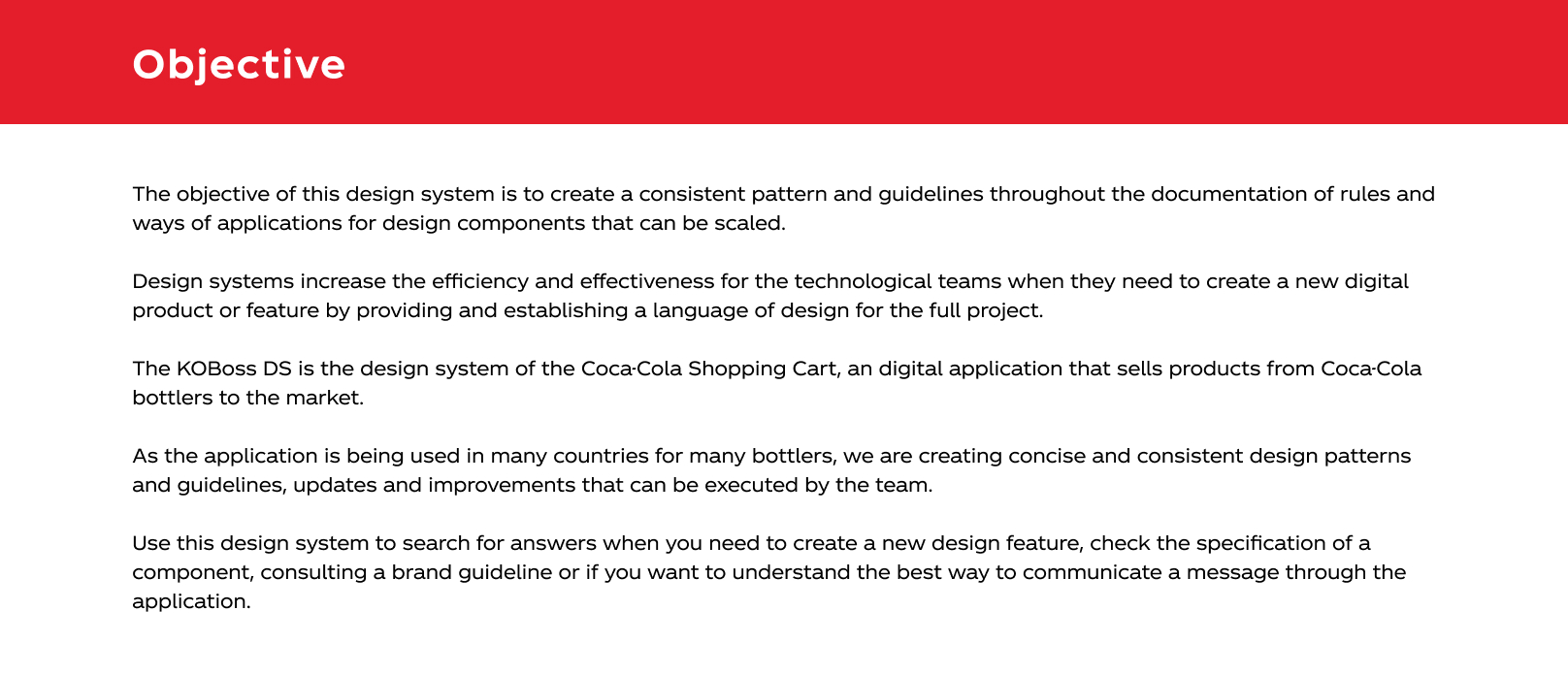
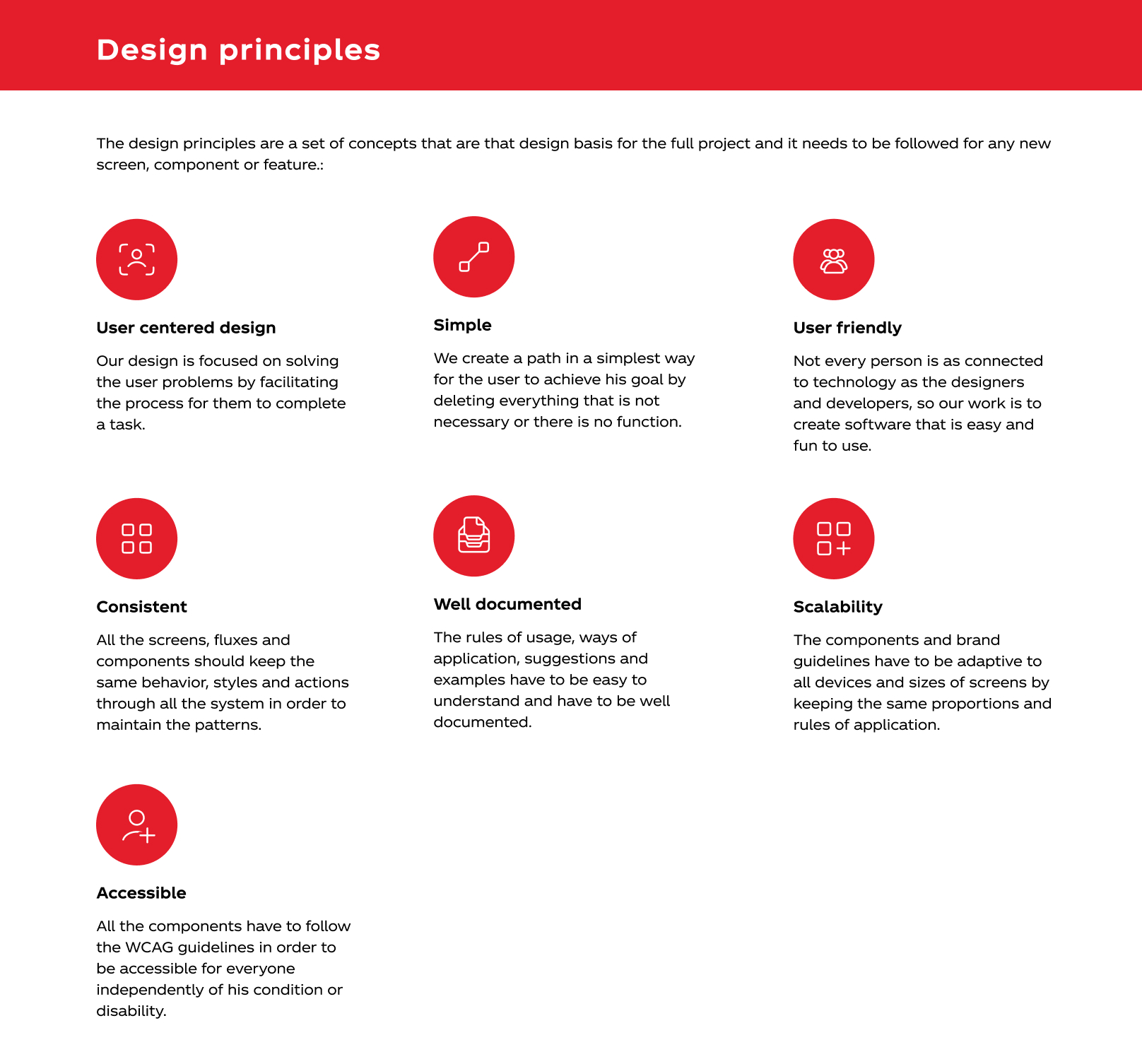
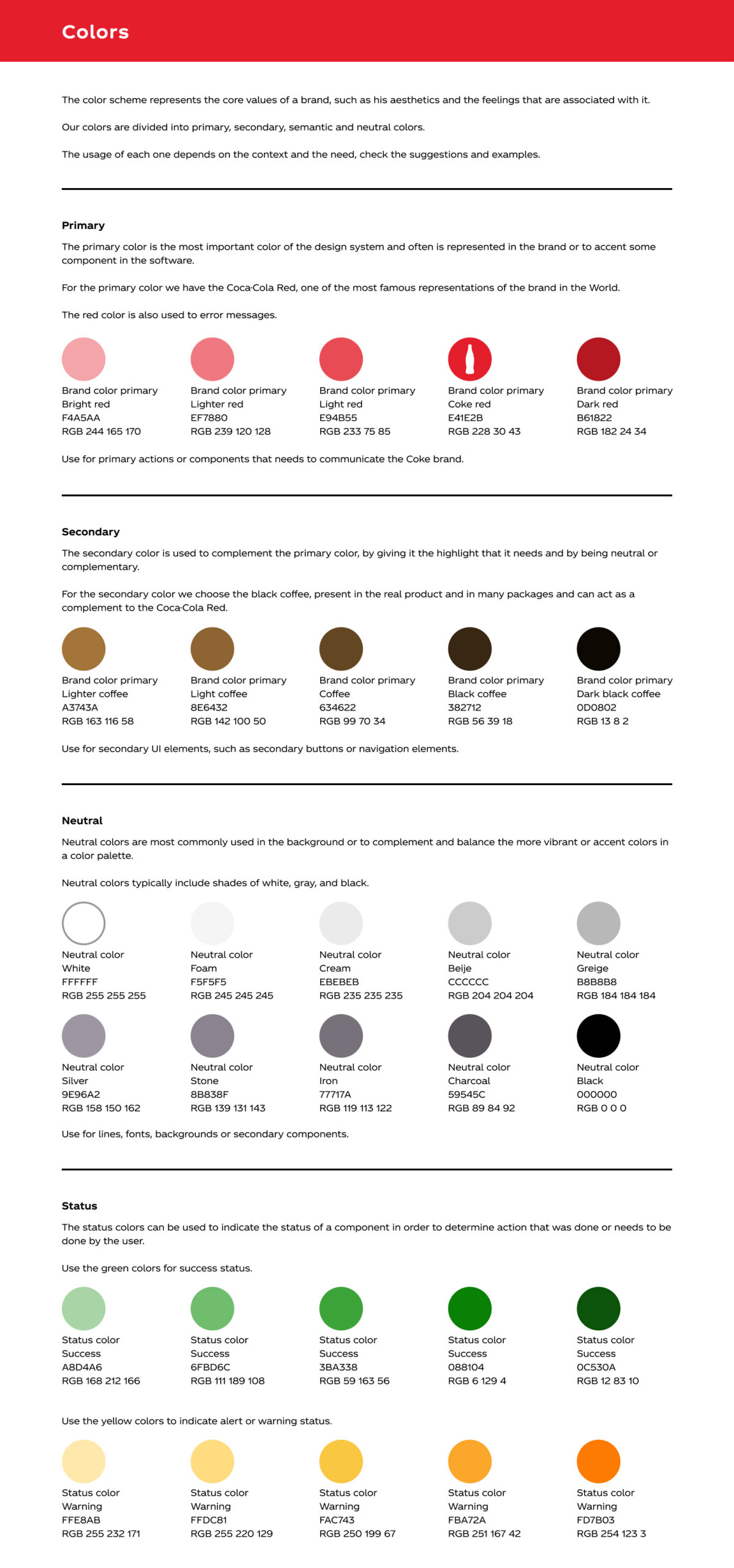
To solve that issue, I suggested to create a design system and set all the patterns for the components and screens.


Task – Equipment maitenance
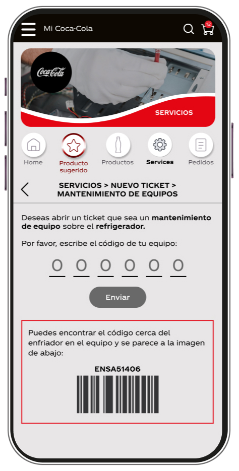
Following a the Discovery done on task and before we implement the Equipment Maintenance flow on Shopping Cart Latam, I needed to present some UX proposals, since the current flow for Solar in BR bot is only on Whatsapp and the ideia is to migrate it for Shopping Cart.
The first stet was to do an analysis from the current flow of the Equipment Maintenance in order to create a new one specific for the app that could be made in less steps.

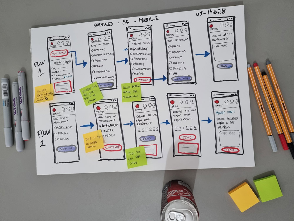
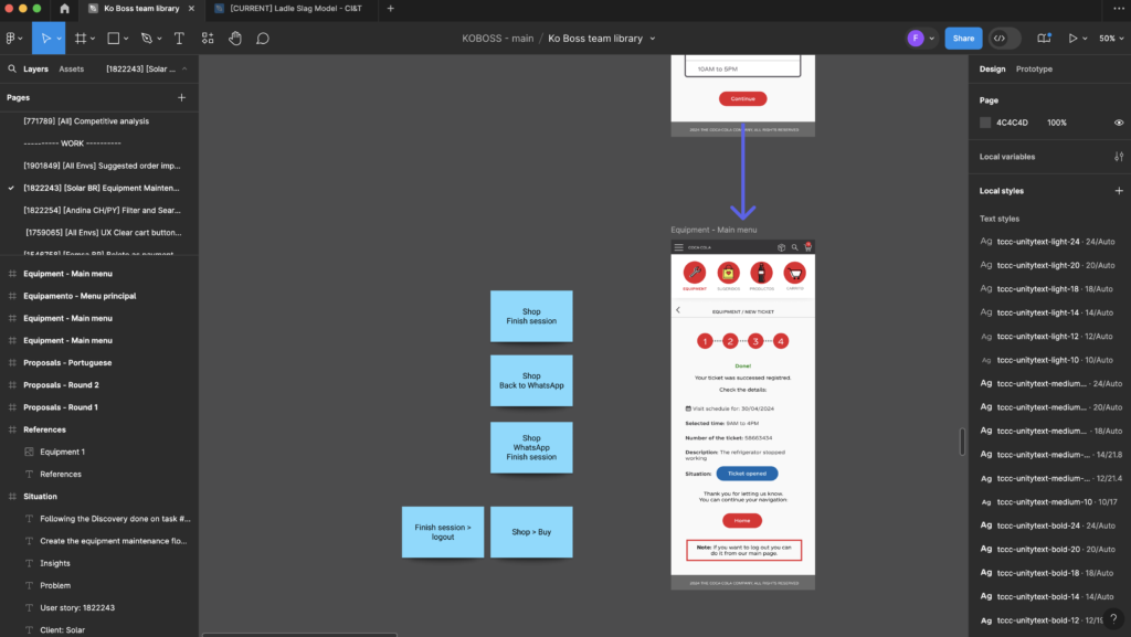
With the new flux in mind, I started to sketch the new possibilities to include the Equipment Maintenance in the app, I also did an workshop with the team to discuss the possible ideas and the creation of the wireframes.
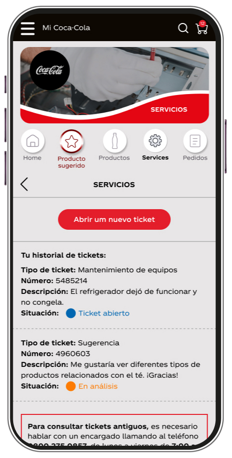
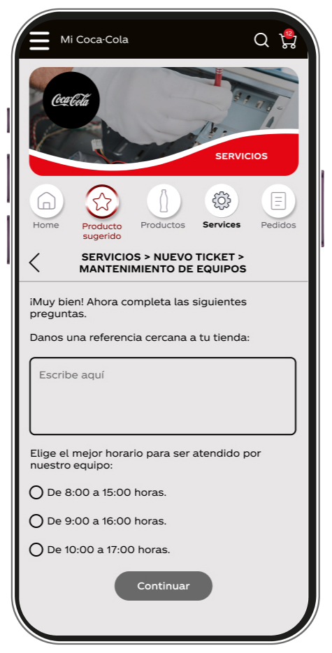
The final result is below.
Task – Suggested Order
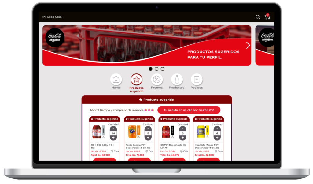
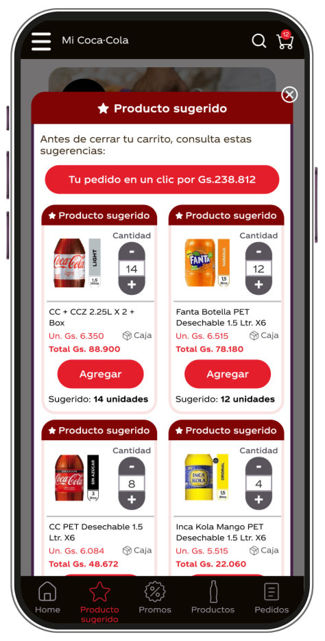
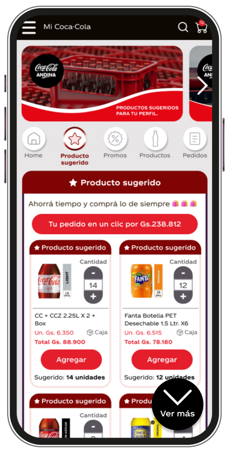
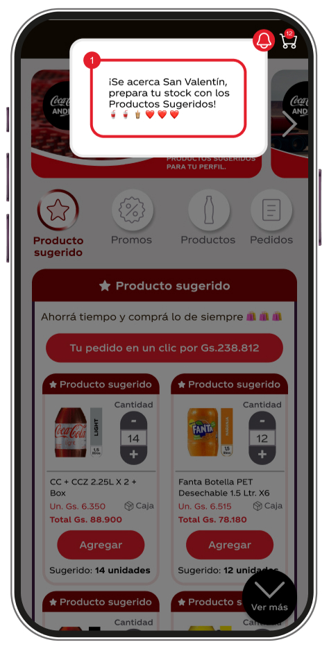
Leveraging historical purchase data, artificial intelligence, and geolocation, the Suggested Order products are tailored recommendations designed to meet the unique needs of each bottler. This personalization not only enhances sales but also boosts conversion rates.
Each month, the Suggested Orders in the app are refreshed based on user interactions, keeping bottlers informed and engaged with their recommendations.
All delivered tasks
During the period working together we achieved the following features:
- Promotions section;
- Suggested order page;
- Maximum amount in the cart feature;
- New color palette for the system;
- Design system;
- Branding;
- Naming;
- Erase product option
- Maintain Quantity After Adding to Cart;
- Include information about product package on the system;
- Boleto as payment method;
- UX Clear cart button on mobile view could be adjusted;
- Filter and Search options in the app;
- Equipment Maintenance on Latam Shopping.
What did I learn?
— Conduct workshops through many teams with different backgrounds and roles;
— How to work in a digital application for many bottlers in different countries;
— How to improve the selling process between B2B clients;
— Spanish as a new language for me.
