Accessibility

Built for everyone.
Tested to prove it.

I design products for people with very different needs, so my own site should work for all of them too. This page explains the standard I follow, what I changed, how I tested it and what is still open, with before and after screenshots.

Standard

WCAG 2.2, level AA

Last tested

November 6, 2026

Result

0 automated issues on 12 pages, desktop and mobile

01 · The standard

Why WCAG 2.2 AA

The Web Content Accessibility Guidelines (WCAG) 2.2 are the W3C standard for accessible websites. Level AA is the level most laws and companies ask for. It covers things like readable contrast, a site you can use with only a keyboard, motion you can stop, and a structure screen readers can follow.

There is also a level AAA. The W3C itself does not recommend requiring it for a whole site, because some content can’t meet it. I went for AA everywhere and adopted a few AAA practices where they cost little and help a lot: larger touch targets, a very visible keyboard focus, and animation that switches off when you ask your device for less motion.

I chose not to add an accessibility widget (the floating panel with font size and contrast buttons). Your browser and operating system already do that better, and those widgets often conflict with screen readers. The site should be accessible by default, not after you press a button.

02 · How I tested it

Automated checks and real keyboard use

Every page type was tested: the home page, the five cases, the Design Notes list, the four posts and this page.

  • Automated auditThe axe-core engine, with the WCAG 2.0, 2.1 and 2.2 A and AA rules plus best practices, on desktop and mobile widths.
  • Contrast, measuredEvery text color checked against its real background with the WCAG contrast formula, not by eye.
  • Keyboard onlyEvery link and button reached with Tab, in a logical order, with a visible focus ring.
  • Zoom and small screensNo horizontal scroll and no cut text at 320 px wide, the same as zooming a desktop browser to 400%.
  • Reduced motionPages checked with the system setting “reduce motion” on: animations and autoplaying video stop.
  • StructureLandmarks, heading order, page language and alternative text reviewed on every page.
03 · What changed

Before and after

The first audit found four groups of problems. Most of them were small color decisions that looked fine on my screen but were hard to read for people with low vision, in bright light or on a cheap display.

01

The headline highlight was too dark to read

1.4.3 Contrast2.1:1 → 3.5:1

The highlighted phrase on the home page used a dark wine red on black. Large text needs at least 3:1, and it had 2.1:1. It now uses the brand red from the logo, #C9212B, so the brand stays the same and the phrase is readable.


Before
Before: home headline on black, the phrase from paper sketch to AI execution and working code in a dark red that blends into the background
After
After: the same headline with the phrase in a brighter brand red that stands out clearly from the black background
02

Small red labels on dark backgrounds

1.4.3 Contrast3.2:1 → 5.1:1

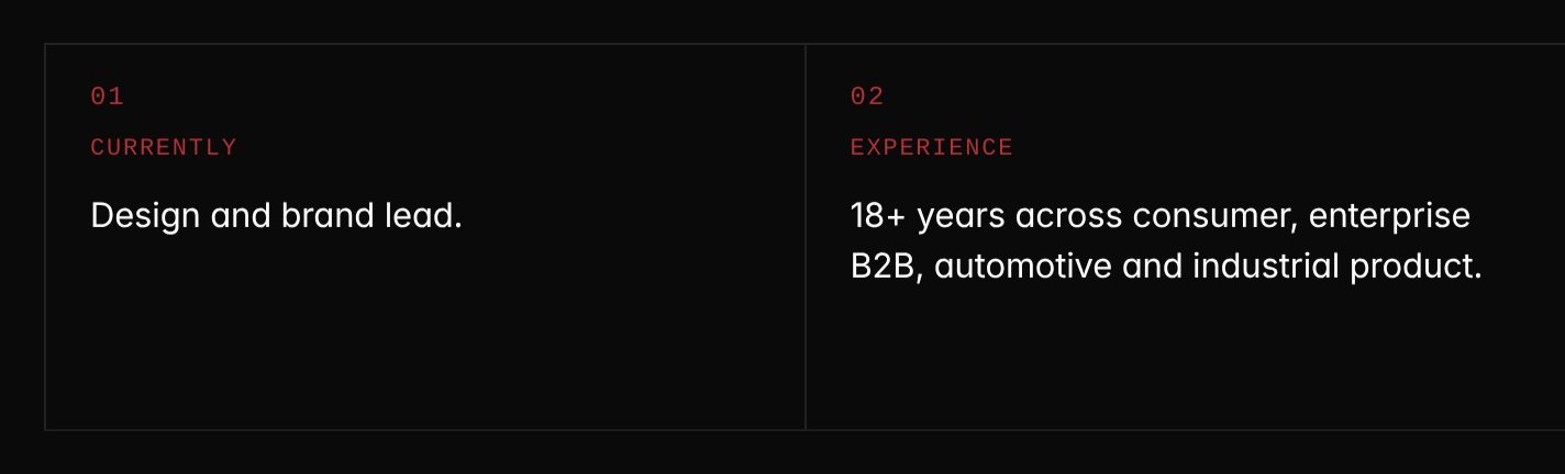
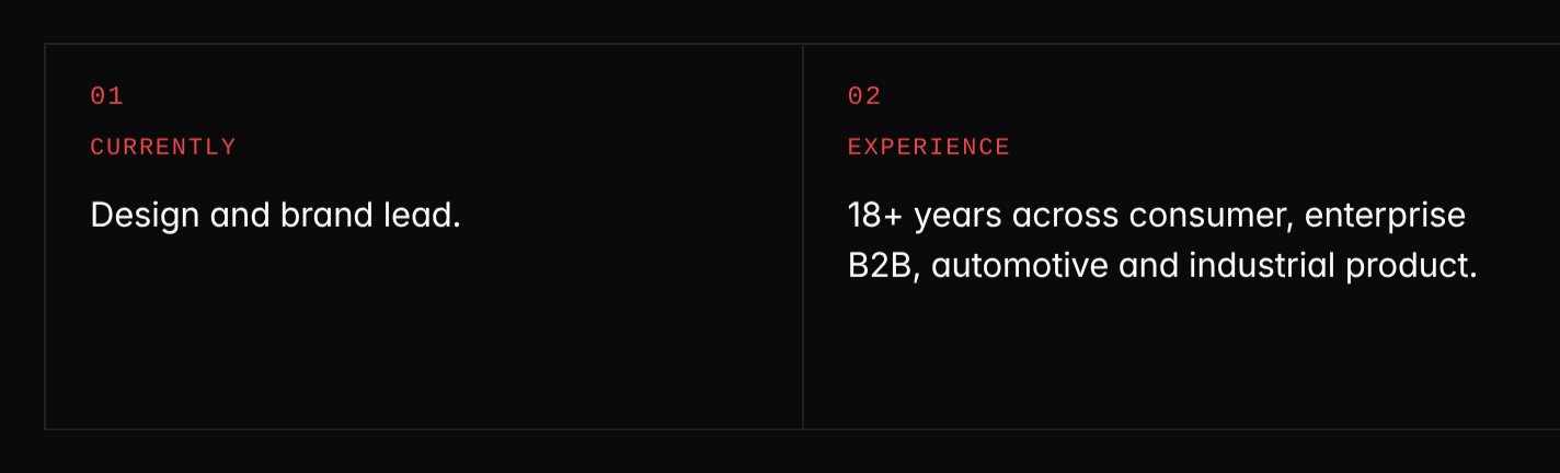
Small text needs 4.5:1. The labels under the hero (Currently, Experience, Practice, Based) and the category tag on each post were below that. On dark surfaces they now use a lighter red, #E5484D. On light surfaces the original dark red stays, because there it already reaches 8:1.

Before
Before: hero labels 01 Currently and 02 Experience in a dim red on black
After
After: the same labels in a lighter red that is easy to read on black
03

Light grey details that almost disappeared

1.4.3 Contrast2.4:1 → 5.2:1

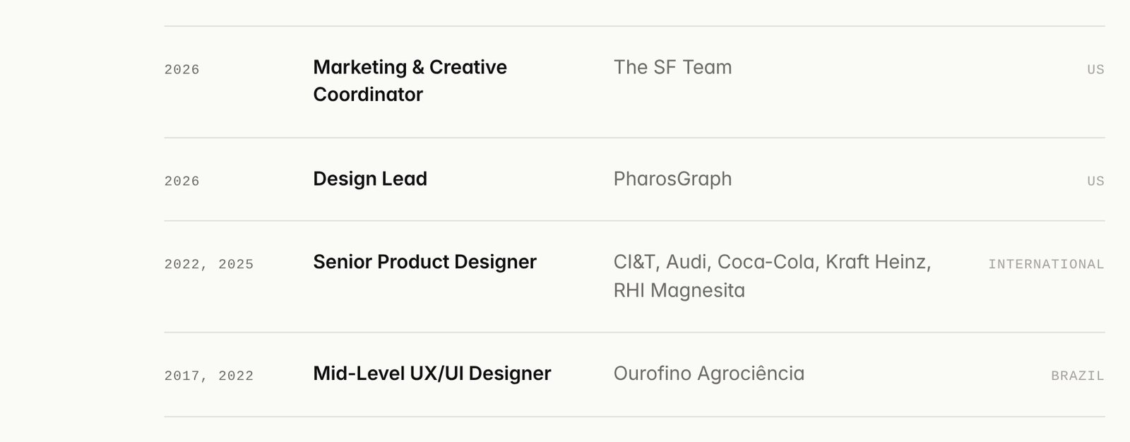
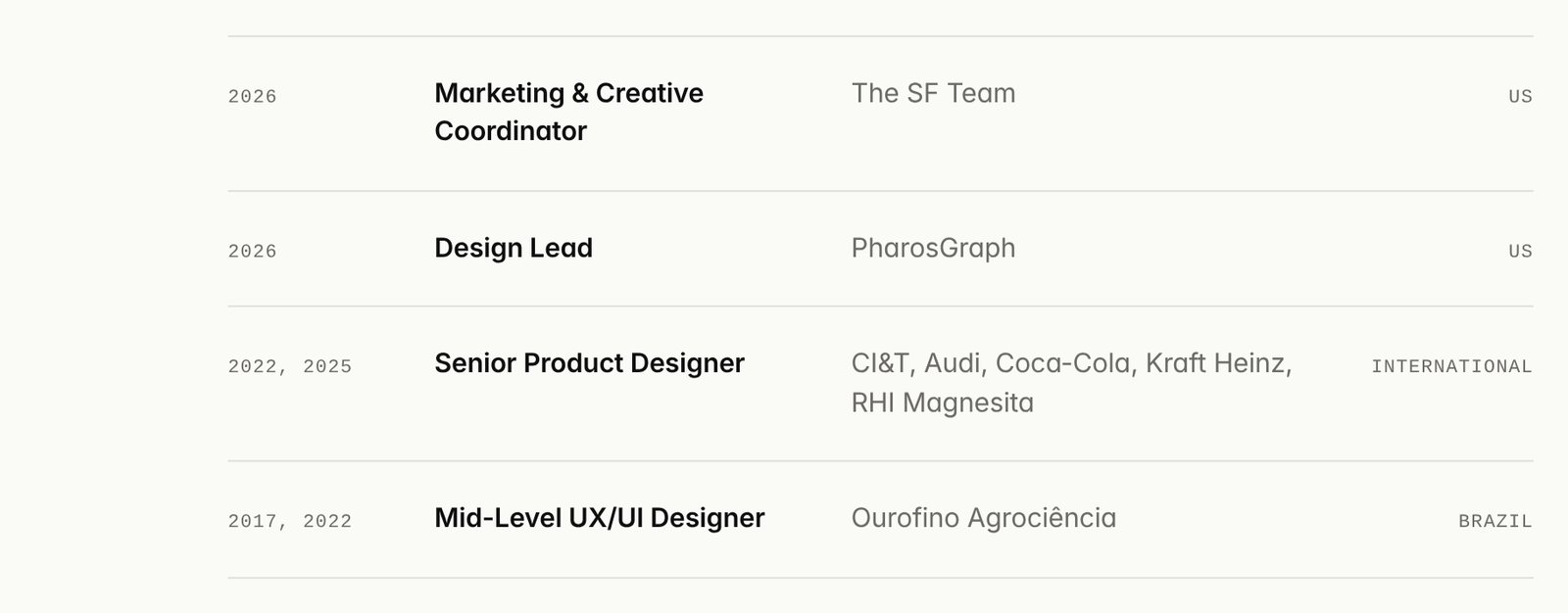
The country next to each role in my experience, and the date and reading time on Design Notes cards, used a very light grey on an off-white background. They now use the same darker grey as the rest of the secondary text.

Before
Before: experience list where the country labels US and International are a pale grey that is hard to see
After
After: the same list with the country labels in a darker grey
Before
Before: Design Notes card where the date and reading time line is pale grey
After
After: the same card with the date and reading time in a readable grey
04

Labels in the case details and the footer

1.4.3 Contrast4.1:1 → 6.9:1

The Role, Timeline and Team labels on each case, and the small print at the bottom of every page, were just under the 4.5:1 line. They were brightened, and the footer now carries the line that links to this page.

Before
Before: case details grid with the labels Role, Timeline and Team in a dim grey on black
After
After: the same grid with brighter labels
Before
Before: footer line reading Hand-built with coffee in a dim grey
After
After: brighter footer text with a new line, Built and tested for accessibility, WCAG 2.2 AA, with an accessibility icon
05

Videos you can pause

2.2.2 Pause, Stop, Hide2.3.3 Animation from interactions

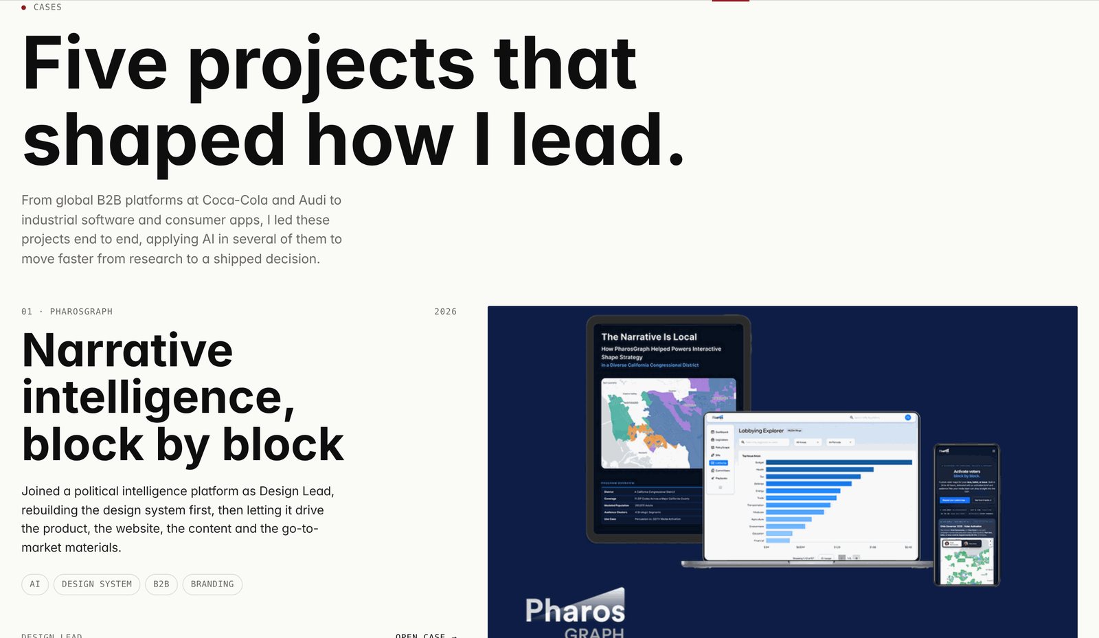
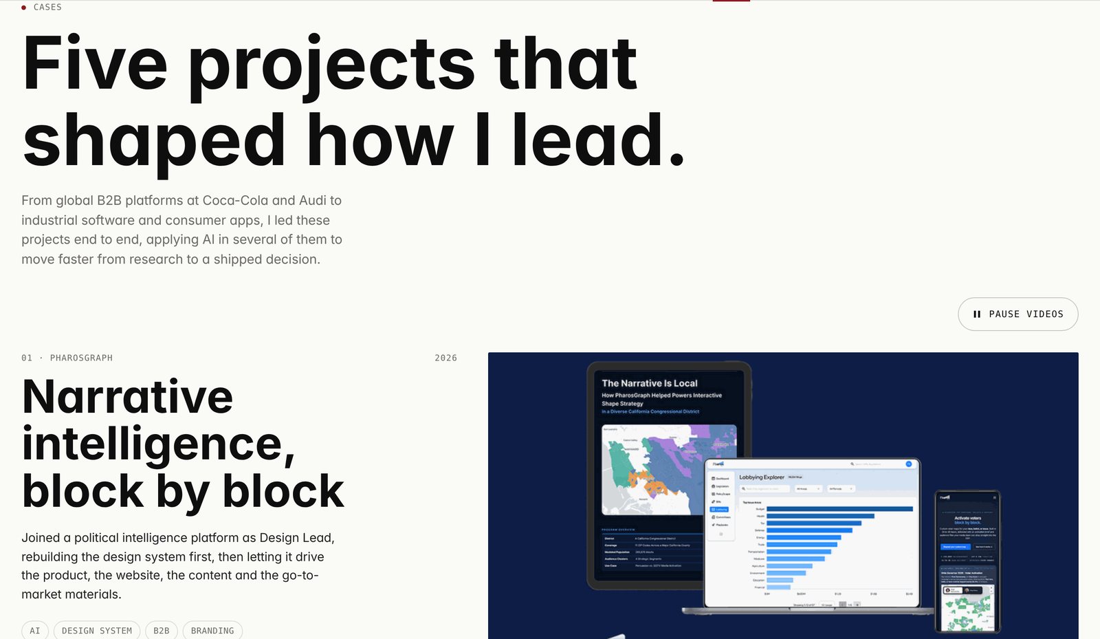
The case covers on the home page play short videos in a loop, and before there was no way to stop them. Moving content can make reading hard, especially for people with attention or vestibular disorders. There is now a Pause videos button, and if your device is set to reduce motion, the videos don’t start at all.

Before
Before: Cases section of the home page with a looping video cover and no control to stop it
After
After: the same section with a Pause videos button above the first case
06

A focus ring you can actually see

2.4.7 Focus visible2.4.13 Focus appearance (AAA)

People who navigate with a keyboard need to see where they are. The browser default was a thin dark line that vanished on the black sections. Now every link and button gets a 3 px red ring that reads on both light (3.9:1) and dark (5.1:1) backgrounds.

Before
Before: How I work menu link focused with a thin black outline
After
After: the same link focused with a thick, rounded red ring
07

Skip to content

2.4.1 Bypass blocks

Keyboard and screen reader users had to go through the seven menu items on every page before reaching the content. Now the first Tab shows a Skip to content link that jumps straight to it. It stays hidden for everyone else.

Before
Before: after pressing Tab, the focus lands on the logo
After
After: after pressing Tab, a Skip to content button appears in the top left corner
08

Back to top

Usability2.5.8 Target size

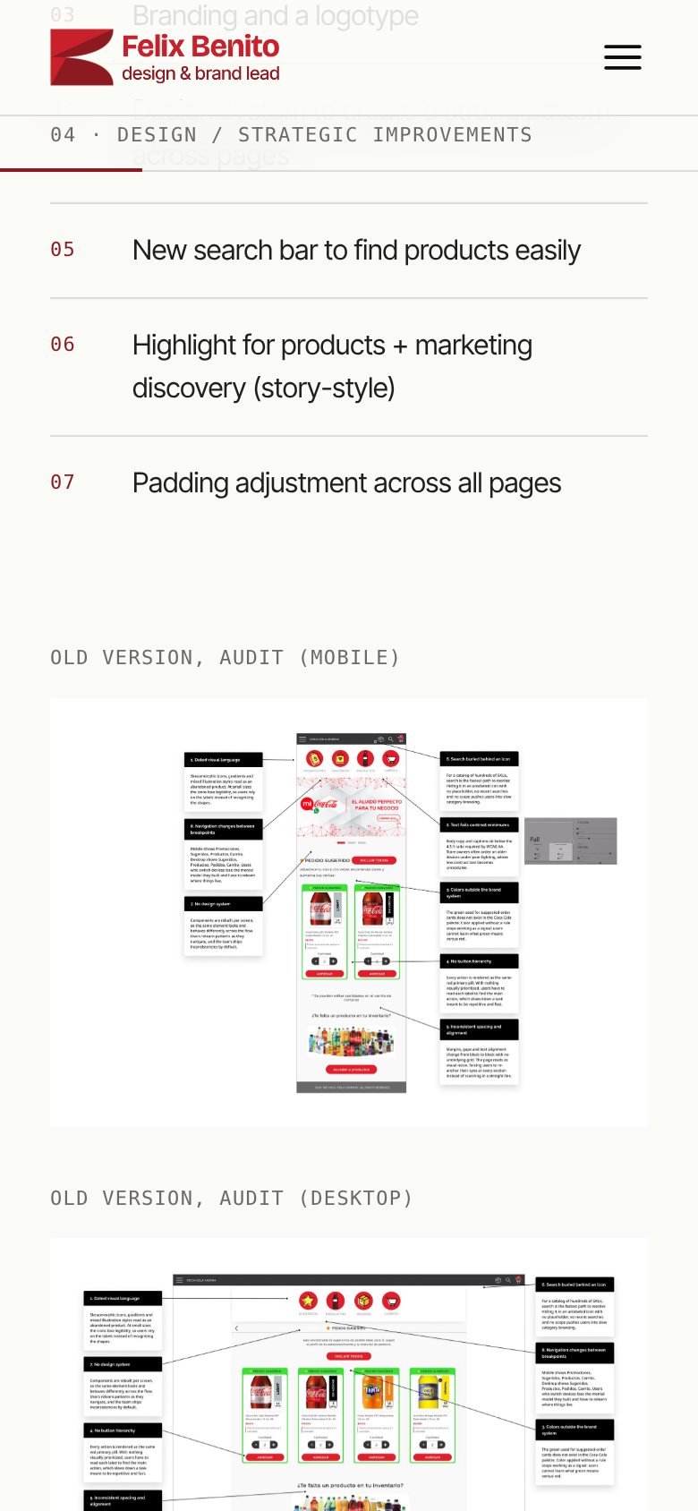
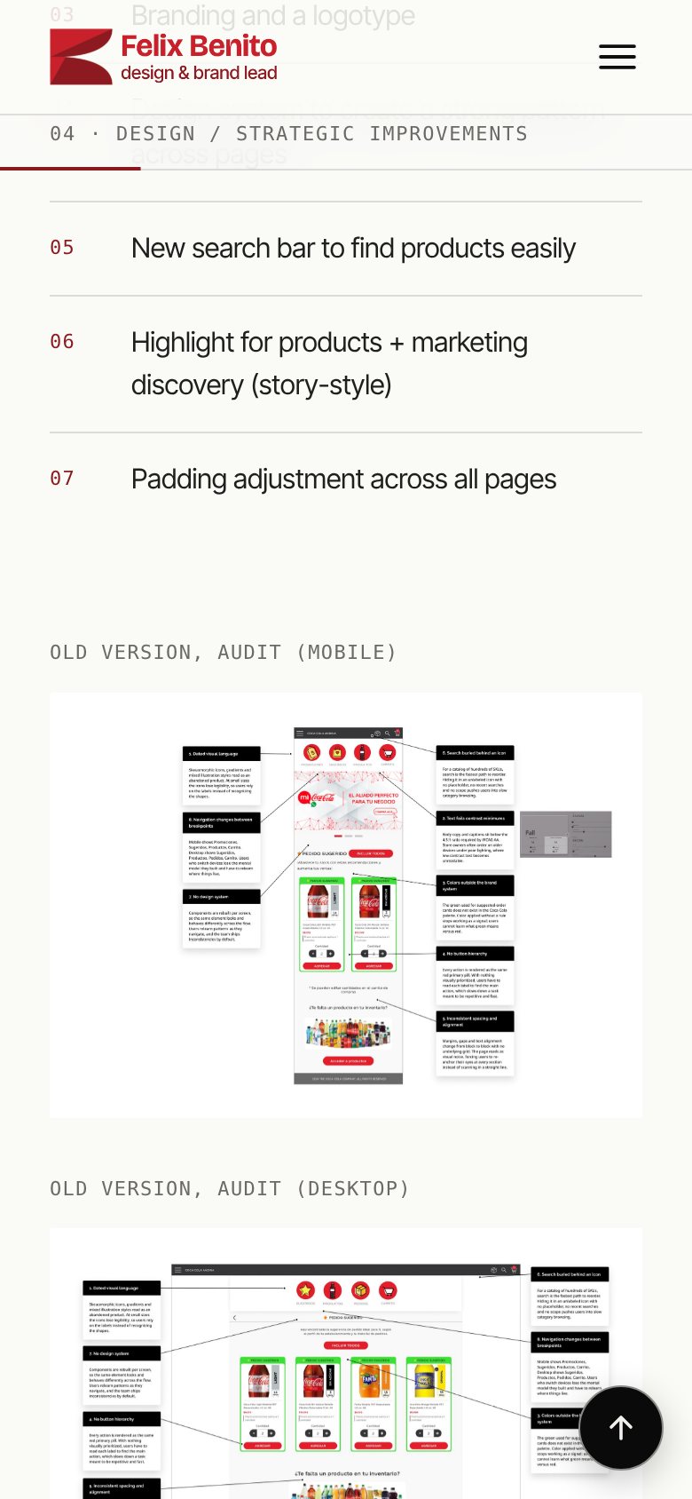
The cases are long, especially on a phone. After you scroll about two screens, a round button appears in the bottom corner and takes you back to the top. It is 48 px or larger, has a name for screen readers, and also moves the keyboard focus to the top, not only the view.

Before
Before: Coca-Cola case scrolled halfway on a phone, with no shortcut back to the top
After
After: the same screen with a round black button with an up arrow in the bottom right corner
04 · Under the hood

Changes you don’t see, but a screen reader does

  • LandmarksEvery page now marks its main content and its footer, so assistive tech can jump between them. 1.3.1
  • Heading orderHeadings follow a clean outline (h1, h2, h3) with no skipped levels, and sections without a title no longer create empty headings. 1.3.1
  • Recommendations carouselThe sideways list of recommendations can receive keyboard focus and has a name, so it can be scrolled without a mouse. 2.1.1
  • Mobile menuThe menu button on the home page now says whether the menu is open or closed, like the other pages already did. 4.1.2
  • Hidden headings for contextLists such as Keep reading and the Design Notes grid have headings that only screen readers announce.
  • Comfortable targetsFooter links got extra padding, and buttons are at least 44 px, above the 24 px minimum of WCAG 2.2. 2.5.8
05 · Already in place

What was right from the start

  • Alternative textEvery image has a description of what it shows, written by hand, not generated from file names.
  • CaptionsThe Breakdown videos have captions burned in, and each post repeats the content as text.
  • Reduced motionScroll animations and the pinned How I work section switch off when you ask your device for less motion.
  • ReflowThe layout adapts down to 320 px without horizontal scrolling.
  • LanguageEvery page declares English, so screen readers use the right voice and pronunciation.
  • No autoplay with soundNothing on the site plays audio on its own.
06 · Known limitations

What is still open

Being honest about the gaps is part of the work.

  • Screen reader testingThe structure was checked with automated tools and by hand, but not yet in a full session with NVDA or VoiceOver. That is the next step.
  • VideosThe Breakdown videos have open captions but no separate transcript file, sign language or audio description. The text of each post covers the same points.
  • Text size settingBrowser zoom works everywhere, but the browser’s “font size” setting doesn’t enlarge every text, because some sizes are set in pixels.
  • Case screenshotsProduct screenshots inside the cases contain small interface text that is described in the alt text, not readable at full contrast.

Found a barrier?

If something on this site is hard to use with your setup, I want to know. Tell me the page, what you tried to do and what you use (browser, screen reader, zoom), and I will fix it.

[email protected]