I led the design of The Sales Ecosystem for Kraft Heinz, a key initiative in the company’s digital transformation, by focusing on Sell-In, Execution, and Sell-Out processes, I translated user insights into a unified, flawless experience for global brands.
My role was from initial discovery to prototyping, testing, and final assessment.
Tools used: Figma, Miro, Illustrator, Photoshop and Jira.
Timeline: 12 months.
Team: 17 people including me as the product designer, managers, developers and business analysts.
Project management: Scrum.
Countries applied: France and Brazil
Problem
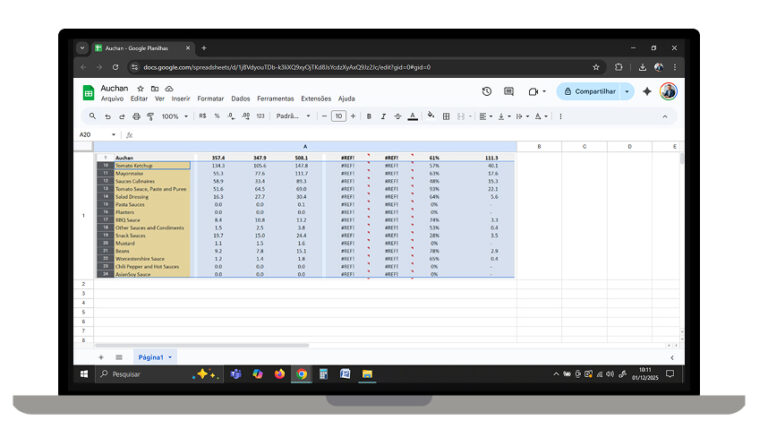
Sales teams relied on fragmented, static spreadsheets to track key performance indicators, leading to reactive decision-making and missed forecast targets
Solution
The main goal was to concentrate the most important information in order to give insights to the sales team in a quickly and easy way to view.
Old version
Inaccurate
Error prone
Complex usability
New version
Automatic
Data validated
Easy to use
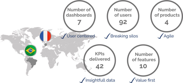
The final result was a serie of dashboards to help the sales team to get insights, creating a single source of truth to unify sales operations and enable predictive strategic planning.
OKRs and approach
We utilize the OKR framework to bridge the gap between high-level vision and tactical execution. By defining clear, measurable goals, we empowered the team to stay focused and deliver high-impact results through collaborative effort.
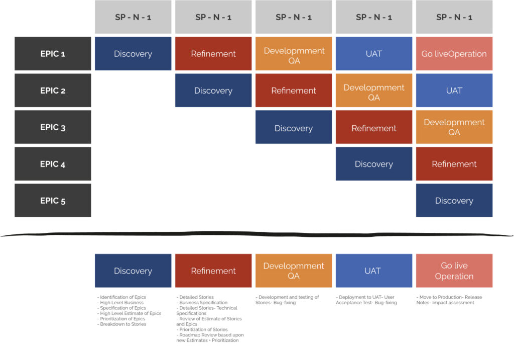
Operations
We operate on a bi-weekly (15-day) sprint cycle, centering our efforts on specific Epics. This focused approach ensures we deliver high-quality design solutions that are both iterative and aligned with our long-term product milestones.
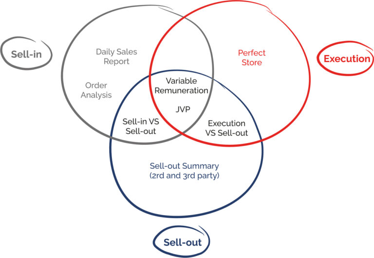
System map
To define the optimal structure for our dashboard ecosystem, we segmented the project into core functional domains.
By partnering closely with the Sales team, we ensured our system map was aligned with both user needs and strategic business objectives.
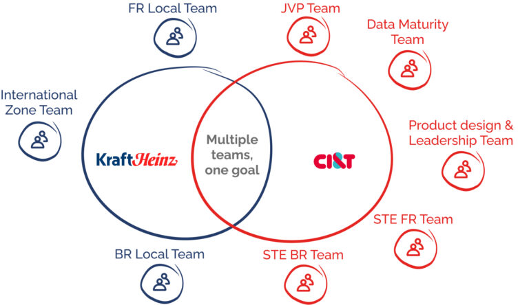
Team
We are working together a big team and a group of stakeholders to create the dashboards.
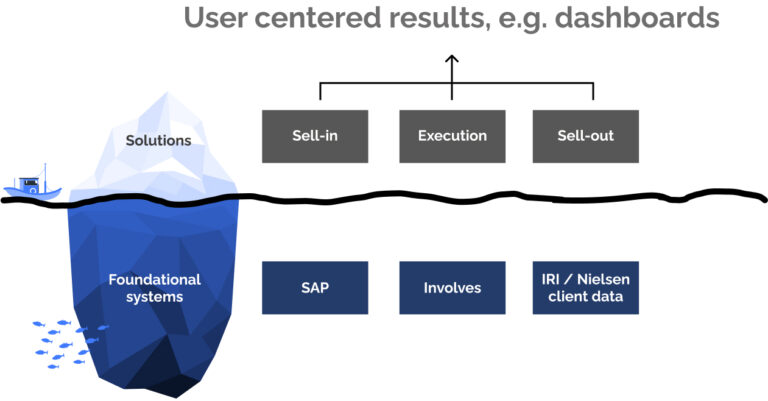
Architecture
Our ecosystem is built on a modular architecture that balances specialized business solutions with foundational data systems. We categorized the product into three core verticals, Sell In, Sell Out, and Execution, integrating deep-level data from SAP, Involves, and Nielsen to ensure a single, cohesive source of truth for the user.
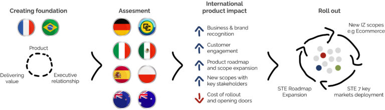
The evolution of the project
We started from France and Brazil, the idea is to continue the development for all the countries that Heinz has business:
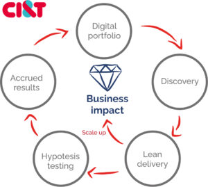
Discovery sessions
My approach to dashboard creation is rooted in cross-functional workshops. I facilitate focused sessions where I bridge the gap between business needs and data reality.
By actively sketching potential solutions with the end-users and validating data opportunities with the analytics team in real-time, we compress the traditional discovery phase and build a shared vision instantly.
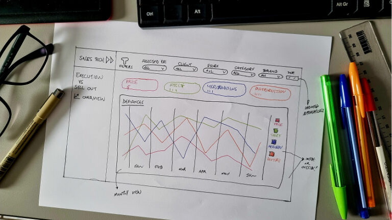
Paper and Lo-fi prototypes
Once the project constraints were defined, I moved into rapid ideation.
I used paper sketches to explore multiple dashboard layouts, followed by low-fidelity prototypes to validate the user flow and structural feasibility before moving into high-fidelity design.
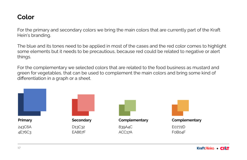
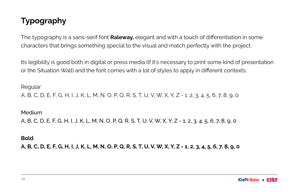
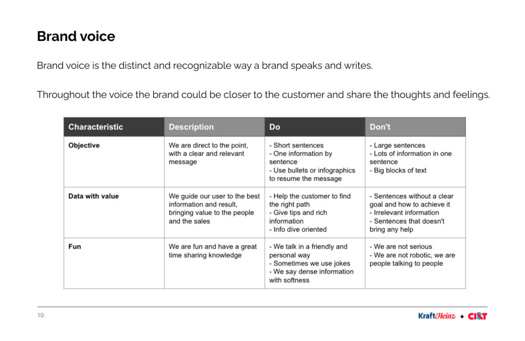
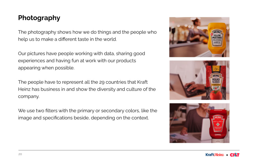
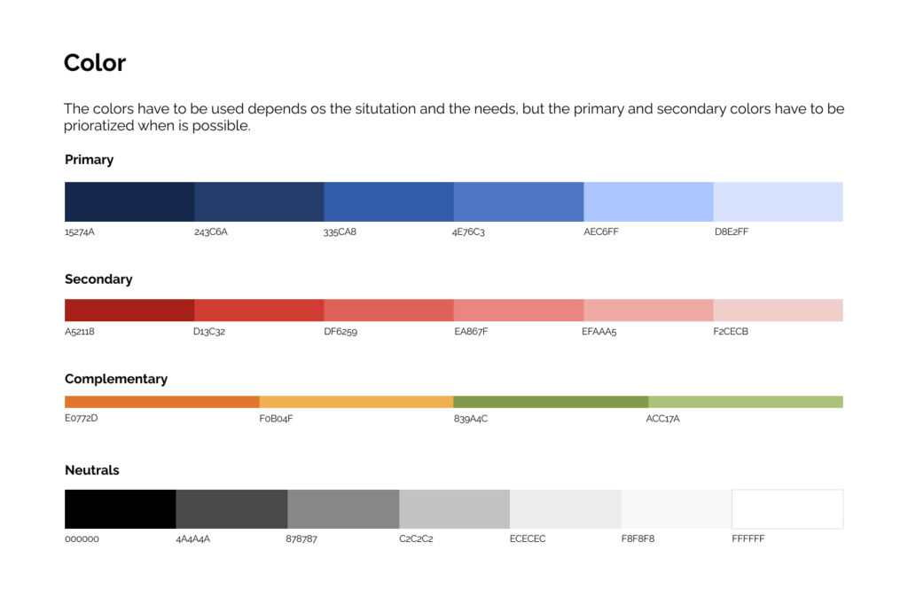
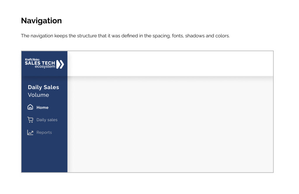
Branding
The branding was created to keep the pattern into the designs and to create a value for the stakeholders.
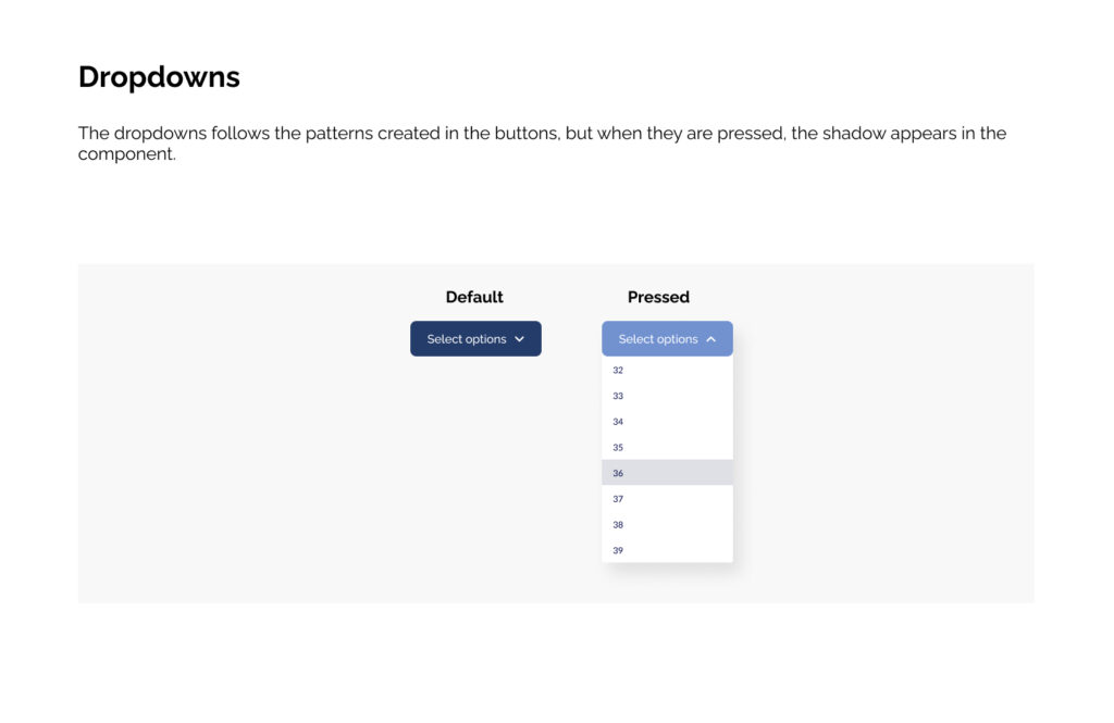
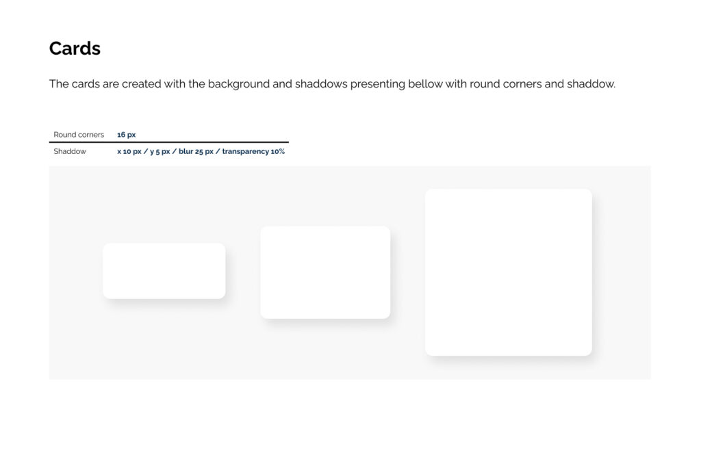
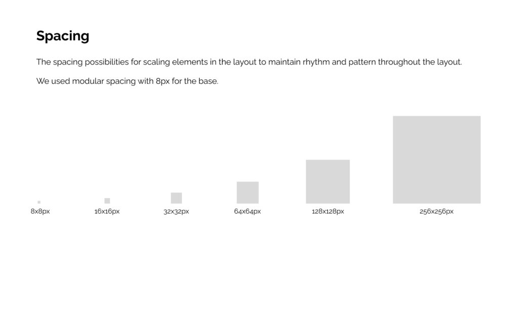
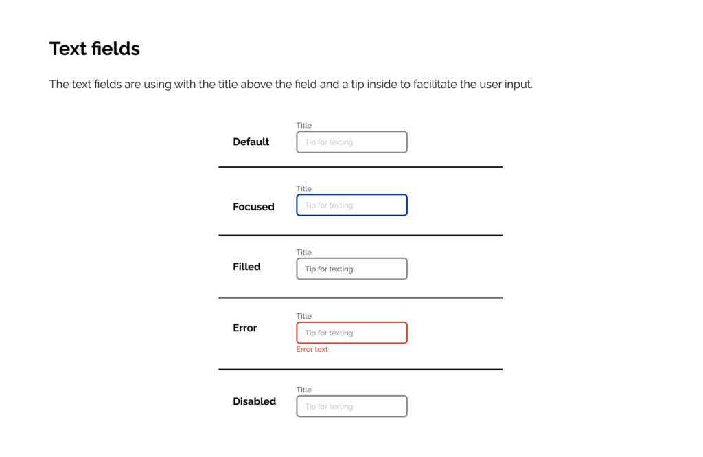
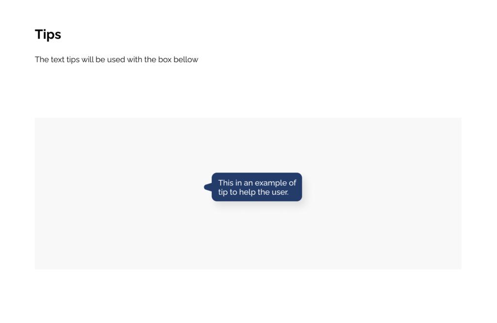
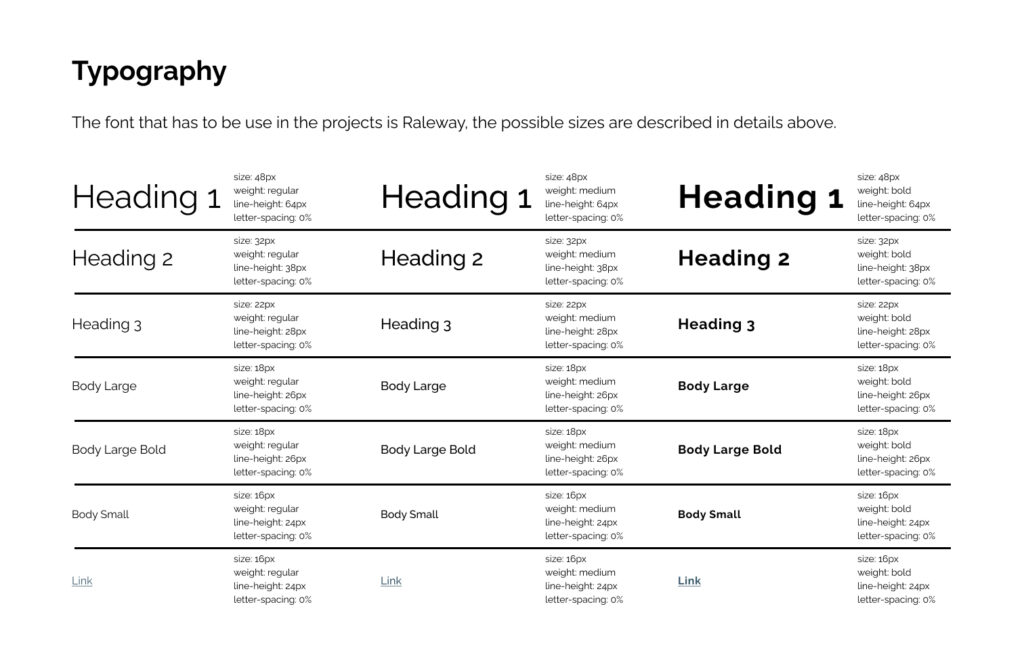
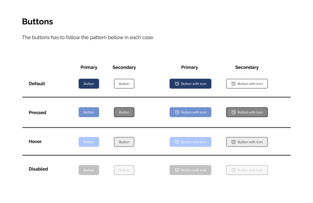
Style guide for dashboards
The style guide was created to keep the design standards for the dashboards and the communications.
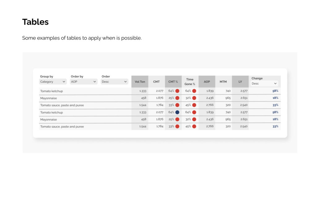
Dashboards
The final deliverable was a suite of specialized dashboards tailored to the Sales Team’s specific workflows.
By translating complex data into actionable insights, we empowered the team to make faster, more informed decisions.
Key design decisions for all dashboards
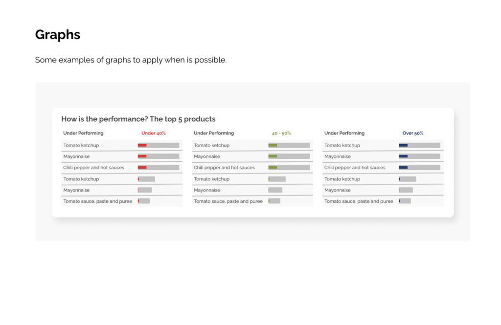
5-second rule: Critical insights visible within 5 seconds
Exception-based design: Red/yellow/green draws attention to action items
Progressive disclosure: Summary first, drill-down available
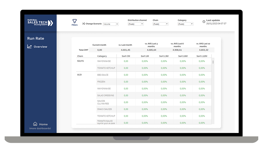
Run Rate
User Problem: Sales managers were struggling to identify performance trends quickly.
Design Solution: This dashboard compares the current month’s performance against multiple time windows to reveal both short-term momentum and long-term trends.
Key design decisions
Multi-timeframe comparison: Enables managers to see if a sales dip is temporary (L1M) or part of a longer trend (L6M/L12M)
Percentage changes instead of raw numbers: Makes performance gaps instantly visible across different-sized accounts
Category-level breakdown: Allows quick identification of which product lines are driving or dragging overall performance
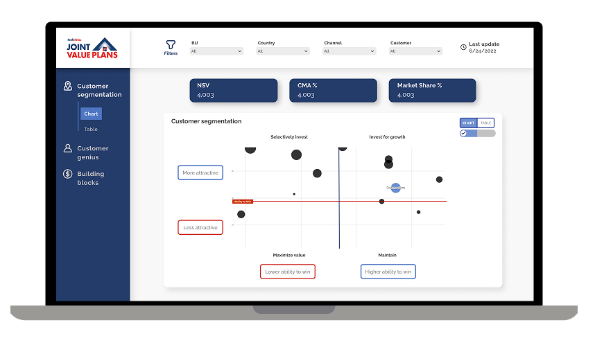
Joint Value Plan
User Problem: Account managers had to manually analyze hundreds of clients to decide where to invest resources.
Design Solution: A 2×2 matrix that automatically segments customers based on “Attractiveness” (market potential) and “Ability to Win” (Kraft Heinz’s competitive position), with bubble size representing revenue opportunity.
Key design decisions
Quadrant-based visualization: Instantly shows which accounts need investment vs. which to harvest or exit
Three key metrics in one view: NSV (revenue), CMA% (contribution margin), and Market Share% provide complete strategic picture
Bubble chart with size variation: Larger bubbles immediately draw attention to highest-revenue opportunities
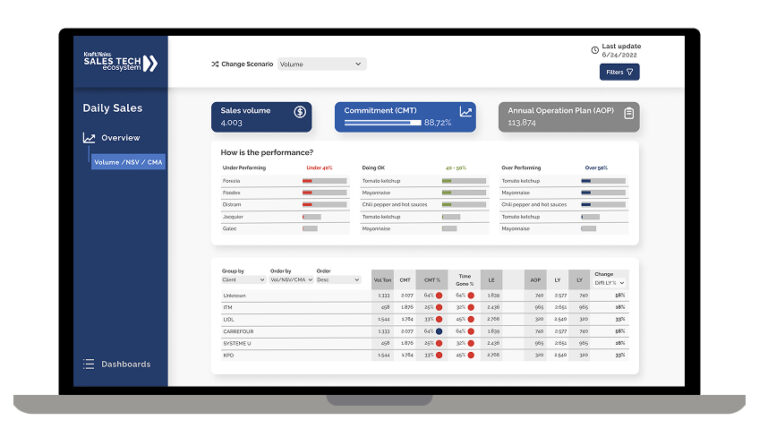
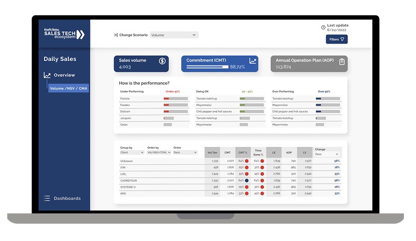
Daily Sales
User Problem: Sales reps only knew if they were on track at month-end, making it impossible to course-correct early.
Design Solution: Real-time tracking of daily sales volume against both monthly commitments (CMT) and annual targets (AOP), with client performance classified into three tiers.
Key design decisions
Three-tier classification system (Under/OK/Over): Immediately shows which clients need urgent attention
Daily granularity instead of monthly: Enables early intervention when performance starts slipping
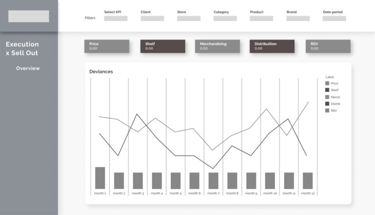
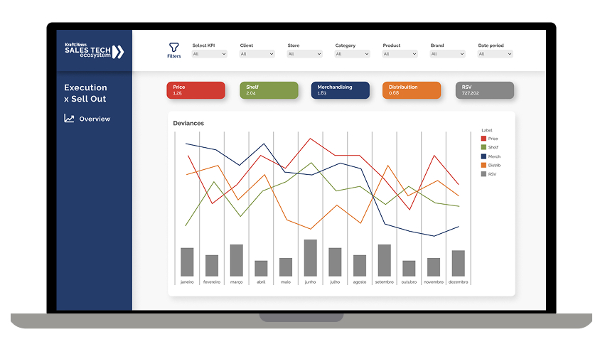
User Problem: Field teams tracked in-store execution metrics (pricing, shelf space, merchandising) separately from sales outcomes.
Design Solution: Unified view tracking five execution drivers (Price, Shelf, Merchandising, Distribution, RSV) with their direct correlation to sell-out performance over time.
Key design decisions
Five metrics in one synchronized timeline: Shows cause-and-effect relationships between execution and sales
Deviation tracking instead of absolute values: Highlights when metrics move away from optimal ranges
Color-coded line graphs: Each metric has a distinct color for quick pattern recognition
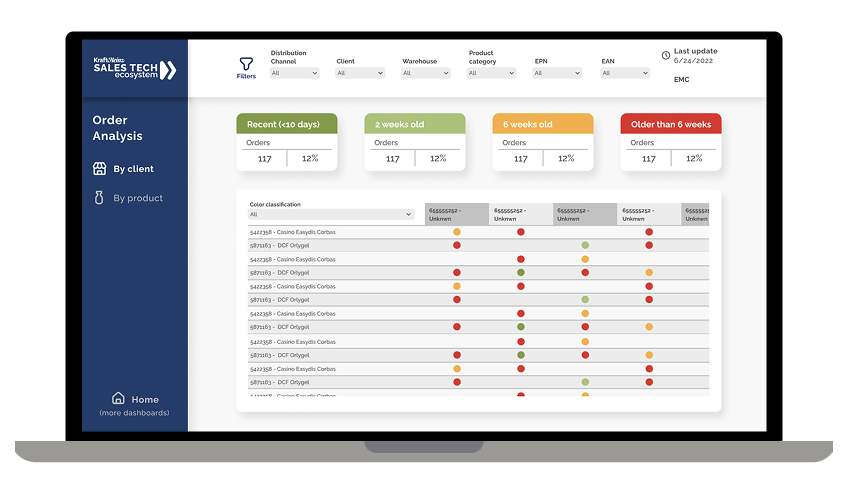
Order Analysis
User Problem: Unfulfilled orders were getting lost in spreadsheets, causing stock-outs at key retailers and damaged relationships.
Design Solution: Age-based classification system showing order fulfillment status across a matrix of clients and products, with visual color-coding for priority.
Key design decisions
Age-based buckets: Immediately identifies which orders are becoming critical
Matrix view by client and product: Shows patterns
Interactive filtering: Allows supply chain teams to focus on specific categories or clients
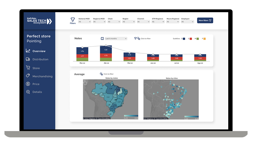
Perfect store
User Problem: Store auditors collected execution scores, but regional managers couldn’t identify which locations or states needed support.
Design Solution: Dual geographic visualization showing perfect store scores at both state and city levels, combined with monthly trend tracking by performance tier.
Key design decisions
Two-map approach: State-level view for strategic planning, city-level for tactical deployment
Color-coded geography: Heat map instantly shows problem regions
Performance tier breakdown (G/P/M/R): Shows distribution of store quality, not just averages
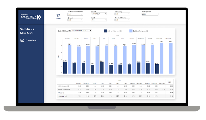
Sell-in vs Sell-out
User Problem: Pricing managers couldn’t see the relationship between the price Kraft Heinz charged retailers (sell-in) and the price retailers charged consumers (sell-out).
Design Solution: Monthly price comparison showing both sell-in and sell-out prices per KG, with gap analysis calculating the absolute and percentage difference.
Key design decisions
Dual-line chart with shared timeline: Makes price relationships immediately visible
Per-KG standardization: Enables comparison across different package sizes and formats
Gap calculation below chart: Quantifies margin opportunity or risk
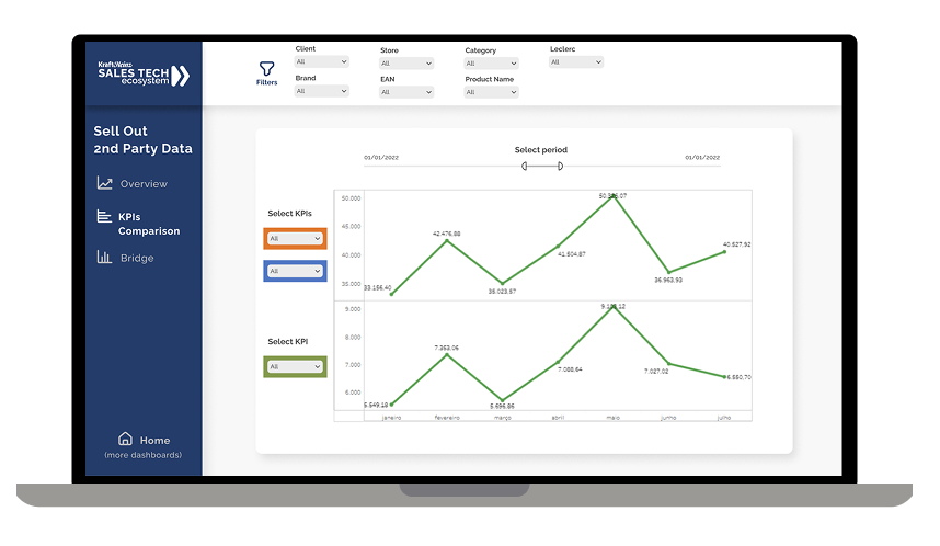
Commercial & Pricing
User Problem: Analysts spent days manually pulling retailer data and creating comparison reports in Excel. By the time insights were ready, market conditions had already changed.
Design Solution: Flexible comparison tool allowing users to select any two KPIs and instantly visualize their relationship over any time period.
Key design decisions
User-selected KPI pairs: Empowers analysts to test hypotheses without IT support
Dual-line graph with independent scales: Allows comparison of metrics with different units (e.g., volume vs. market share)
Dynamic time period selection: Enables both tactical (weekly) and strategic (annual) analysis
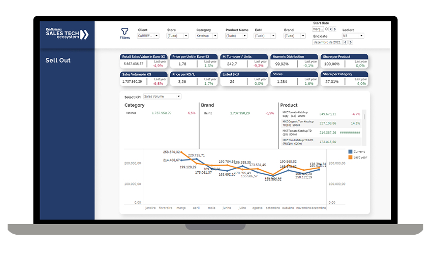
Sell Out
User Problem: Category managers needed to understand how Kraft Heinz products were performing at retail, but lacked visibility into the drivers behind sales changes.
Design Solution: Grid-based metric view showing eight key retail performance indicators with year-over-year comparison, plus trend visualization for the selected KPI.
Key design decisions
Grid layout with percentage changes: Allows rapid scanning of which metrics are improving vs. declining
Year-over-year comparison as default: Accounts for seasonal patterns automatically
Clickable metric selection: Detailed trend appears below when user selects any metric
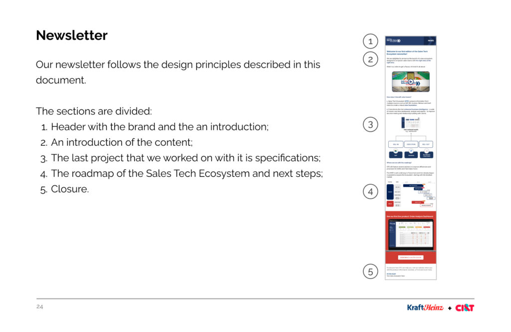
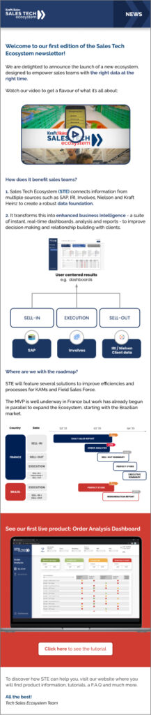
Newsletter
A newsletter was created to share new dashboards, roadmap status and other weekly highlights.
Results
Empowering the sales team with the right data at the right time, with one click
From 20 hours/month to 2 seconds = 36.000x faster
Bringing the sales team closer to other stakeholders
Creating campaigns based on the strategic plan resulting from the data collected in the dashboards